This post is part of our Six Favorite Tableau Tips, Tricks and Hacks to Enhance Dashboards collection.
Coloring a bar chart by a dimension in Tableau provides you with a way to visualize at a lower level of detail, but also limits your abilities with labeling. The default labeling feature will not give you the option to label the sums of the bars, only the individual parts that are colored. This post will show you how to label the totals using reference lines.

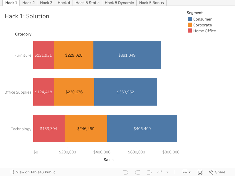
Above is a bar chart colored by segment, so labels are applied at the segment level. We can clearly see the individual sales figures and that the Technology category sells more in total than the other categories. But what if we want to display the total for each category at the end of each bar in order to compare category sales figures, like this?

Step-by-step Guide: Using a Reference Line to Display Totals
To achieve this, we can use a reference line at the cell level to display the total for each bar.
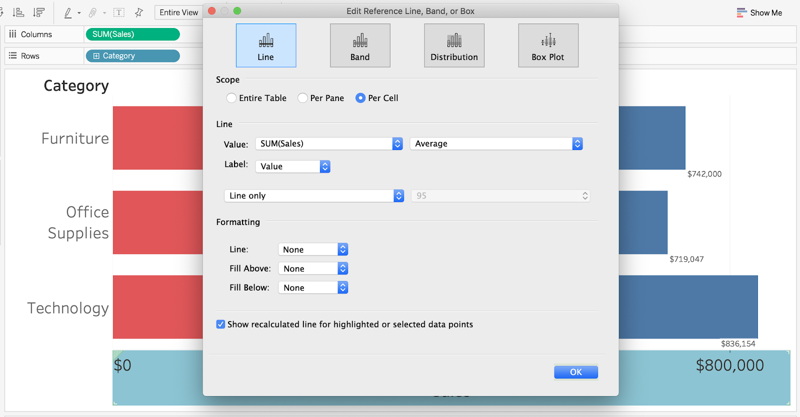
Step 1: Adding a Reference Line to the Bar Chart
Add a reference line at the cell level with the following attributes:
- Value: SUM(Sales) [Aggregation of Average is fine since it is at the cell level]
- Label: Value
- Line: None
- Leave “Show recalculated line…” checked for a cool feature
This will give you the desired labels, but we need to do some additional formatting.
Step 2: Formatting the Reference Line for Proper Alignment
Right-click on one of the reference line labels and select “Format…” Change the alignment from Automatic to
- Horizontal: Right
- Vertical: Middle
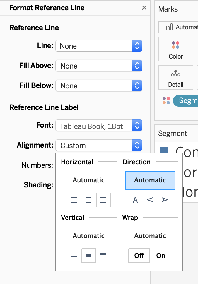
If you have applied any other formatting to the rest of your chart you will need to also do that here to match (like font size in my case as I have enlarged all text to size 18).
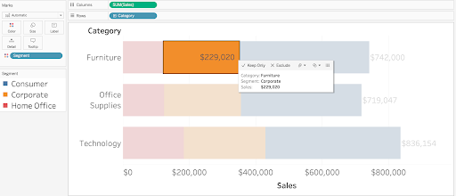
There we go! We now have labels at the end of our stacked bar chart and if we select an individual bar we can see its value because we left the “Show recalculated line…” option checked.
While the primary purpose of reference lines aren’t to show labels on bar charts, in this case we’ve used the reference line functionality as a hack to solve the issue of not having totals in stacked bar chart labels.
Final Workbook on Tableau Public
Written By

Jay Farias
Data Visualization Manager Jay Farias is a technology enthusiast who specializes in Tableau. He has years of experience implementing innovative technology solutions in the construction and healthcare industries. He supports Data Visualization strategy and implementation for Kantar Health and Intuit.