This post is part of our Six Favorite Tableau Tips, Tricks and Hacks to Enhance Dashboards collection.
Tableau is a powerful and flexible data visualization tool, but sometimes you must use Tableau features in unexpected ways to build exactly what you want. For example, say you want to show year-over-year sales broken out by category. We could easily chart last year’s sales and this year’s sales together, but it might be difficult to quickly identify which categories are higher or lower in sales than the previous year.
A great way to simplify this comparison is with an index, so we can quickly compare not only each category’s individual year-over-year change, but also relative changes across each category, regardless of sales volume differences. We can color-code the index to see which categories had relatively higher increases in sales than others.
Visualizing multiple measures in the same table using different chart types presents some unique challenges however. In this scenario, you might typically drag your measures onto the Columns shelf of your worksheet and then update chart types and colors, but data points might not align exactly how you’d like.
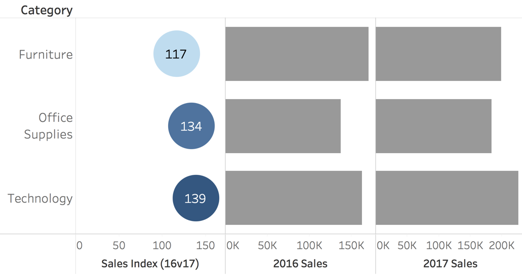
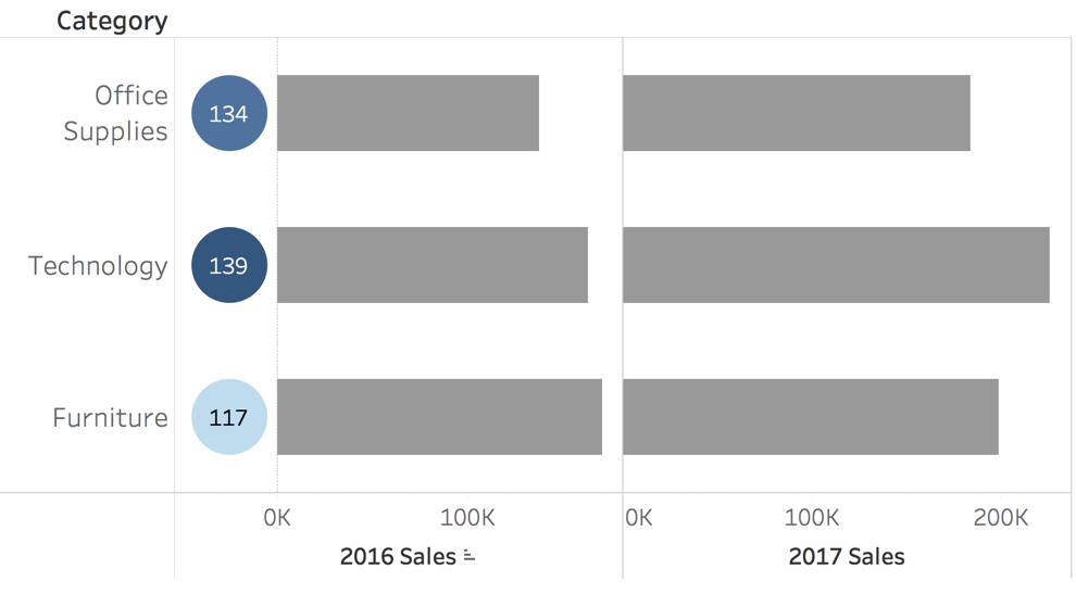
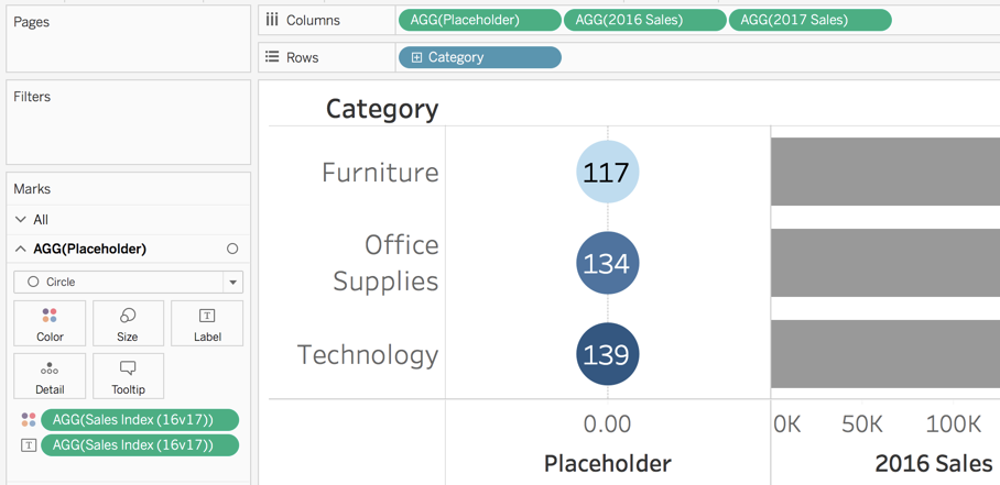
Since the “Sales Index” measure in this example has a range of values, Tableau automatically scales these data points on an x-axis. This leaves undesired white space, and doesn’t provide additional useful information since we also color-code our index circles by the same measure. Instead, we want to align all circles vertically and remove white space to achieve the following.
Creating Placeholder Values to Use in a Tableau Visualization
To achieve this view, we trick Tableau a little bit using something called “placeholders.” Placeholders are calculated fields set to specific values for the sake of positioning a mark at a specific location on a chart axis. Placeholders give us flexibility on where we position data points on a visualization.
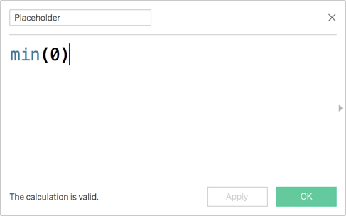
First we must create the placeholder value. Click the dropdown arrow at the top of the dimensions shelf and then select “Create Calculated Field…” to start this process. Once the calculated field window opens, name your field “Placeholder” and type in a value of min(0).
This field is called a placeholder because it takes the place of a measure in the visualization. So instead of dragging the Sales Index measure onto the Columns shelf with the two annual Sales values, we use the Placeholder field.
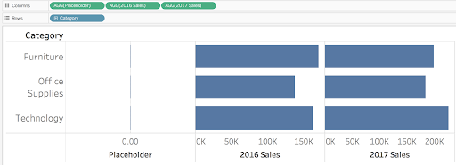
Next, we update the Marks card to change the Placeholder shape to Circle and adjust the size to something that looks better in our visualization.

We now need to encode the Placeholder with information for the Sales Index measure. We drop the Sales Index measure on both the “Label” and “Color” to encode the “Placeholder” mark. We also need to update the Placeholder Label to center alignment.
Adjusting Placeholder Value Column Width to Get Rid of White Spaces
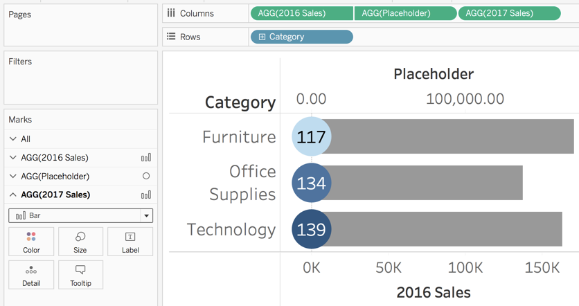
Now we’re getting pretty close but not quite there yet. There is still a lot of white space around the Placeholder value, even once our circles vertically align. Because Tableau wants to be helpful and keep our column widths evenly distributed, we have to trick Tableau to position the Placeholder exactly where we want it. We set the Placeholder measure to Dual Axis with our first Sales value and also synchronize the axis.
Tableau will try to be helpful again by changing all field Mark types to Circle, so we need to change the type for the two Sales measures back to Bar. We also click and drag the Placeholder value to the second position on our Columns shelf so that it displays over our Sales value bar.
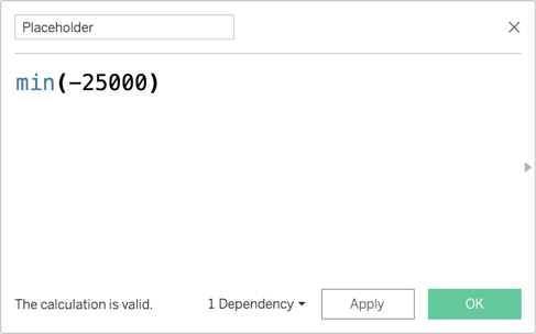
At this point, we’re really close to our desired result, but we want the Placeholder circle to precede the bar, rather than overlap. To achieve this, we adjust the value in our Placeholder calculated field to different negative values to shift the circle to the left of the bar. This can take some trial and error to find the best value, but for this example, we’re using min(-25000).
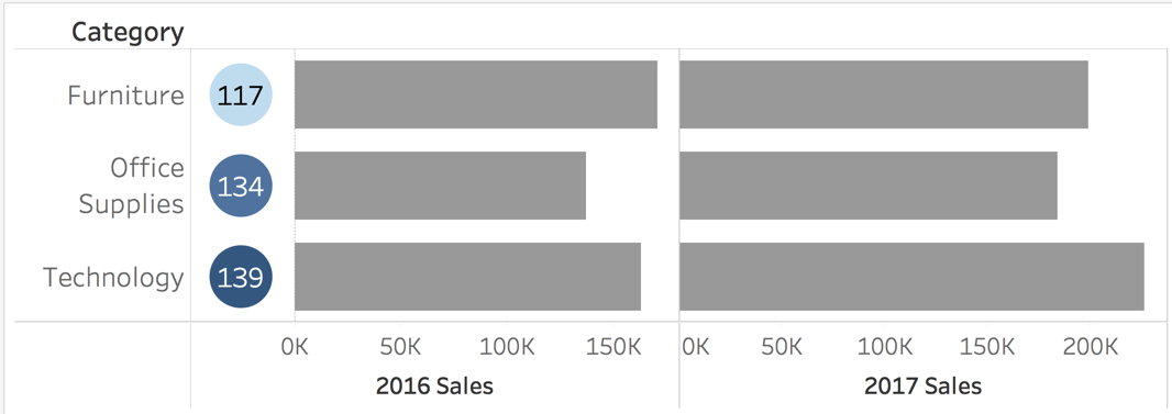
Now the Placeholder circle positions nicely in front of the first Sales value bar. We also hide the header for the Placeholder to clean up the viz by right-clicking the header and clicking to deselect the “Show Header” option.
Replacing Static Placeholder with Dynamic Placeholder to Adjust to Future Changes
Depending on the size and scale of your viz, you may get negative values showing on the synced x-axis for 2016 Sales. If this happens you can clean it up by increasing axis “Tick intervals” to a larger value under the Tick Mark options. Access these options by right-clicking the Sales x-axis and choosing the “Edit Axis” option.
This static placeholder option works great as long as the expected range of values in the viz doesn’t change dramatically over time or as filters are applied. If this is expected however, then we should create a dynamic placeholder instead. Most of the process is exactly the same as a static placeholder, except we’ll adjust our Placeholder value to scale as the scale of other values change.
To create a dynamic placeholder, we use a WINDOW_MAX function instead of the MIN function in our Placeholder calculated field. We divide the maximum value shown in the window for our 2016 Sales value by a negative factor to shift the placeholder by a specific degree to the left of Sales bar. Again, finding the exact right value to divide by might take some trial and error, but -6.5 works well in this example.

Replacing Static Placeholder with Dynamic Placeholder to Adjust to Future Changes
Now if date ranges change or we apply filters that scale our Sales value differently, the Placeholder will scale dynamically as well to maintain its relative position on the shared axis with the Sales value.
I hope this gives you another tool to keep in your Tableau toolbox and inspires you to keep using Tableau in new and unexpected ways!
Final Workbook on Tableau Public
Written By

Chase Porter
Chase Porter, Director of Data Operations, guides clients through the process of accessing, visualizing, and sharing data. His primary specialty is integrating, visualizing, and analyzing data from numerous systems to assess multi-channel program effectiveness and optimize conversion performance. He also provides analytical thinking and strategic guidance supporting performance analysis and program optimization for clients such as St.Jude/ALSAC, LogMeIn, and Intuit. Chase was nominated as a 2019 DAA Difference Maker Finalist.