In the last Tableau Fundamentals post, we shared five different ways to make a bar chart in Tableau.
This post walks you through how to build another kind of data visualization: the line graph.
For all the fancy visualizations we enjoy building with Tableau, at the end of the day, bar charts and line graphs are two of, if not, the most effective options available.
While we’re at it, we’ll touch on some related topics including date hierarchies and independent axes so you can master this foundational graph.
How to Make a Line Graph in Tableau
A line graph is similar to a bar chart in Tableau in that you are looking at one or more measures with the option to ‘slice and dice’ it by one or more dimensions.
The important distinction between the bar chart and line graph is that the line graph must include an element of time.
Let’s build out a line graph using the Sample – Superstore data set using Order Date as our element of time.
First, use any of the five methods discussed in the last post to create a bar chart that adds SUM(Sales) to the Rows Shelf.
We are going to simply double-click on the Sales measure to start the view.
At this point, you could also double-click on your element of time (Order Date) to start a line graph, but there is a better way.
As with measures, dates also have an aggregation and can be used as continuous or discrete fields. The choices you make for these two classifications will impact how the visualization will look.
Fortunately, it is easy to see all of the options if instead of double-clicking on the Order Date dimension, you right-click and drag it to the Columns Shelf.
Before Tableau generates the visualization, you will see the following options:
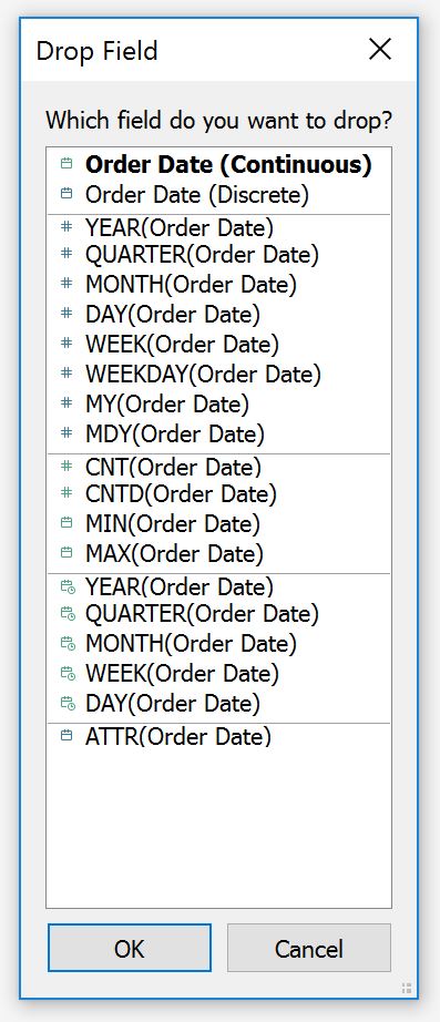
As you can see, each option has a blue or green icon immediately preceding it.
Remember, the blue color coding in Tableau indicates discrete, while green color coding indicates continuous. The choice of whether you select a discrete or continuous option should be based on what type of visualization you want to create.
Let’s say that we want to look at a continuous trend over time, which means we can ignore the blue options for now.
The next choice we have is how granular we want the continuous trend to be.
For this analysis, let’s say we want to see a monthly trend over time.
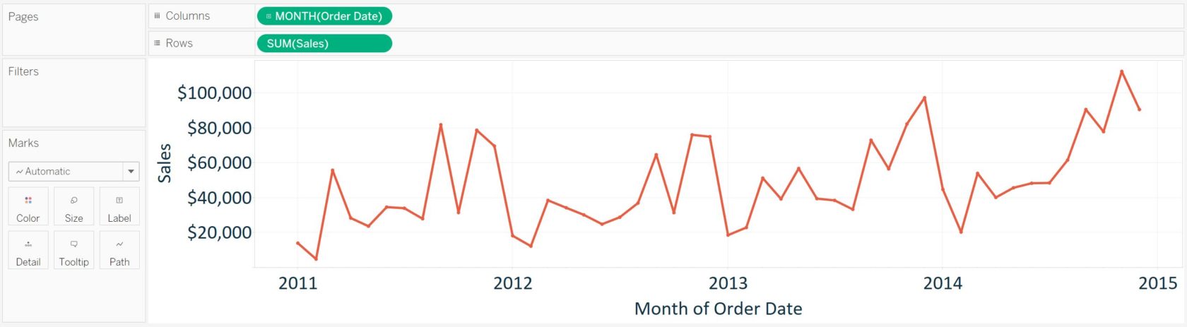
With these two requirements in mind, we know that we should pick the choice with a green icon with an aggregation of Month, which is the fourth choice from the bottom.
After making this selection, the line graph looks like this:
Independent Axes in Tableau
The line graph created in the previous section can now be sliced and diced by additional dimensions by simply dragging them to the Columns Shelf or Rows Shelf and dropping them in front of the continuous fields on the view (currently MONTH(Order Date) or SUM(Sales)).
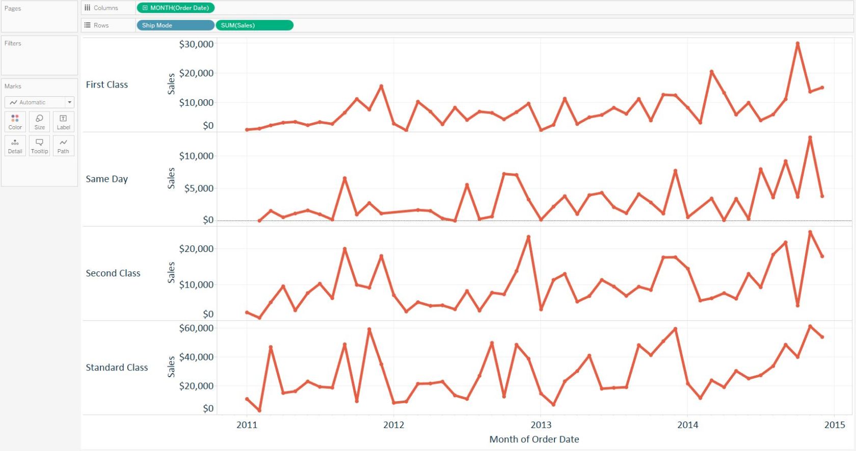
To demonstrate how axes work across multiple columns or rows in Tableau, we will drag the Ship Mode dimension to the Rows Shelf:
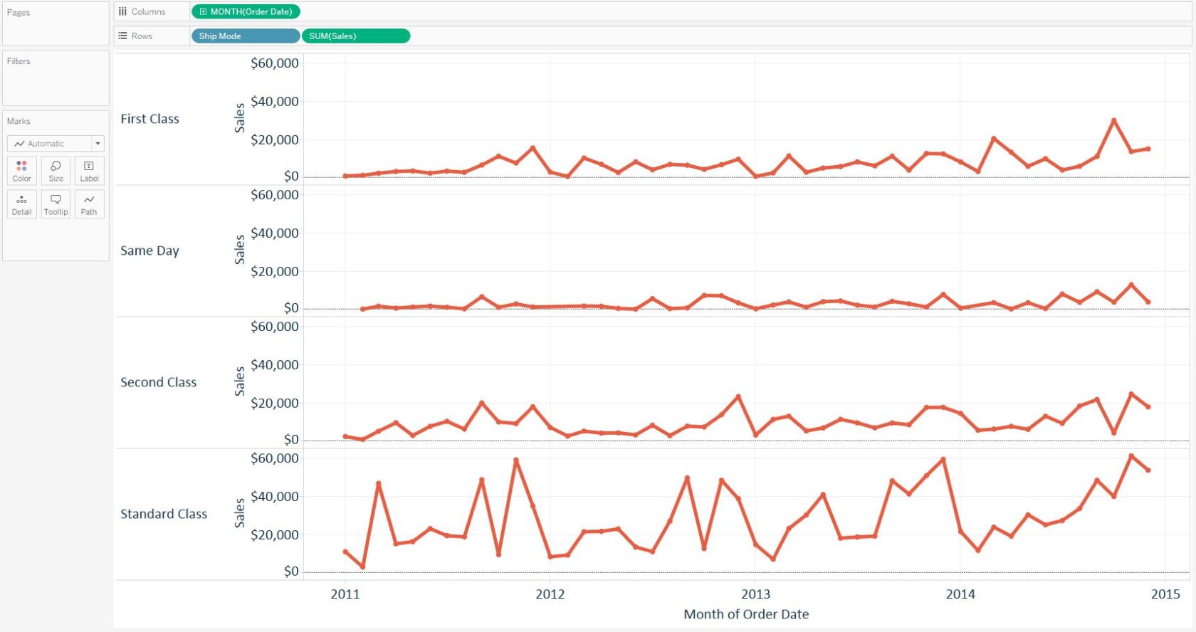
Notice that, by default, each row shares the same axis range from $0 to approximately $60,000, which is the largest range across all four ship modes.
This default setting where the axes share the same range is helpful because it provides an ‘apples to apples’ comparison across the four rows.
However, it can be difficult to see the trends for each individual row. If you would like the four axes to have their own axis range, right-click on any of the axes and choose “Edit axis…”. You will be presented with a dialog box where you can choose “Independent axis ranges for each row or column”:
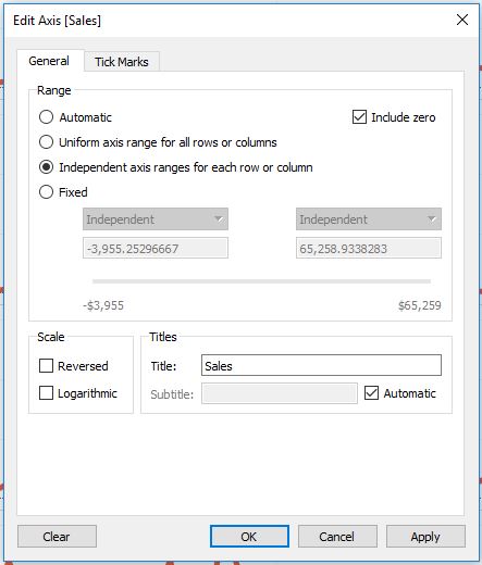
Upon making this selection, you will see your trend graph change so that each row has its own unique range:
Date Hierarchies in Tableau
For the final section in this post, let’s take a step back by building the line graph again, this time by first double-clicking on the Sales measure and Order Date dimension.
At this point, your line graph should look similar to this:
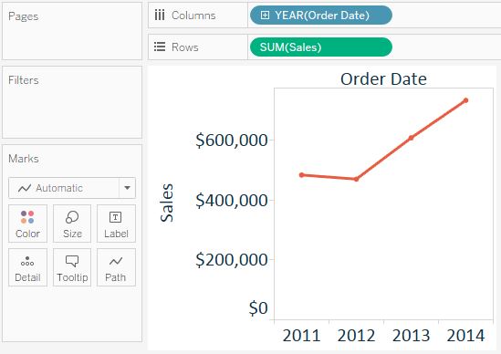
The blue YEAR(Order Date) pill is telling us that date is being aggregated by year and being used as a discrete field.
When dates are being used as discrete fields, you will see a ‘+’ sign on the field, which indicates this field has a hierarchy. Dates are one of the few special dimensions in Tableau which automatically receive a hierarchy, and it goes in this order: Year > Quarter > Month > Day.
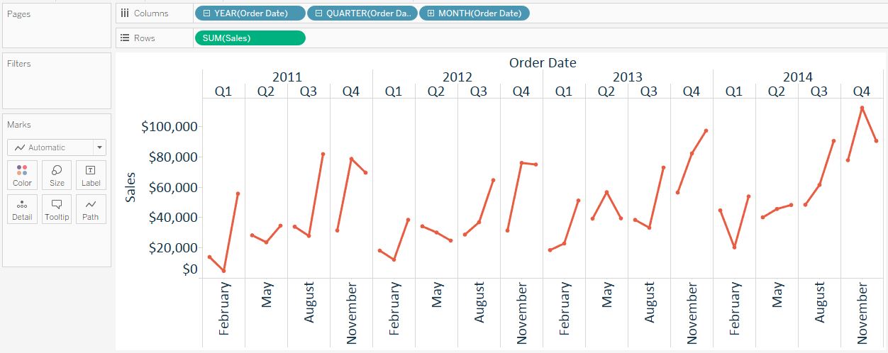
To utilize the hierarchy, simply click the ‘+’ sign on the field. The field will expand to the next level of the hierarchy and provide a different view.
Here’s how this same view looks if we click the ‘+’ on Year, then click the ‘+’ on Quarter:
You can also drill back ‘up’ by clicking the ‘-‘ sign that appears on fields where the ‘+’ has already been clicked.
What’s nice about these fields is that, because they are discrete, they can be moved around into different orders to quickly create different analyses. The fields are processed in order, so with the last line graph pictured, the Sales measure is first cut by Year, then Quarter, then Month.
To demonstrate a couple of possibilities, let’s first remove Quarter from the view, leaving us with Year and Month:
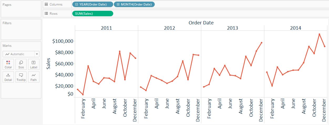
At this point, we have a pretty standard analysis, where our years and months go in chronological order from oldest to most recent. This creates a seasonal analysis where you can compare four calendar years to each other. Look what happens when you simply change the order of Year and Month by dragging the Month pill in front of the Year pill:
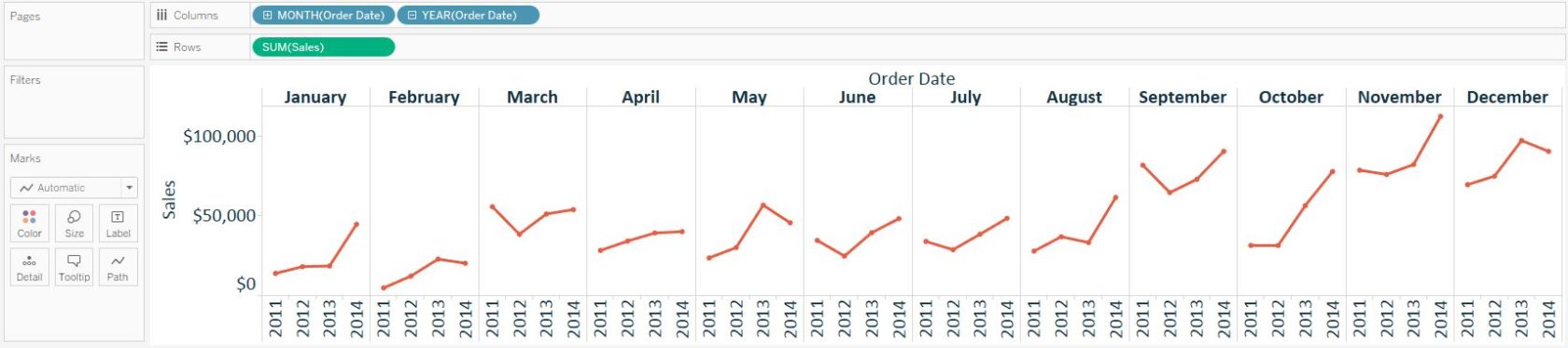
The fields are processed in order, so now the Sales measure is first cut by Month, then Year. This completely changes the analysis into a four-year trend per month.
While line graphs may seem simple on the surface, they are extremely powerful visualizations, and Tableau provides the flexibility to use them for many different analyses.
Written By

Evolytics
This post is curated content from the Evolytics staff, bringing you the most interesting news in data and analysis from around the web. The Evolytics staff has proven experience and expertise in analytics strategy, tagging implementation, data engineering, and data visualization.