Control charts, or Shewhart charts, were designed to evaluate whether production is in a state of statistical control. Along with Pareto charts, histograms, and scatter plots, they are one of the seven basic tools for quality control. Basic control charts show a time-series analysis with reference lines that show the average performance along with an upper control limit, typically three standard deviations above the mean, and lower control limit, typically three standard deviations below the mean.
Control charts were originally called Shewhart charts, named for Walter Shewhart, who invented the visualization type while working on a way to improve the reliability of the telephony transmission systems at Bell Labs in the 1920’s. Control charts were born in, and are still primarily used for, evaluating manufacturing processes. For example, a factory may use this type of analysis to predict production levels and have a statistical indicator for when corrective action needs to be taken.
How to Make Control Charts in Tableau
While designed for manufacturing, we find control charts to be useful for any measure in which historical data can be used to predict performance and provide visual cues for when a statistically significant change is occurring in the business. In that vein, and so we can all follow along using the same data, this tutorial will create a basic control chart which evaluates the Profit Ratio measure in the Sample Superstore data set.
To create a control chart, start by creating a continuous line graph that looks at Profit Ratio by week:
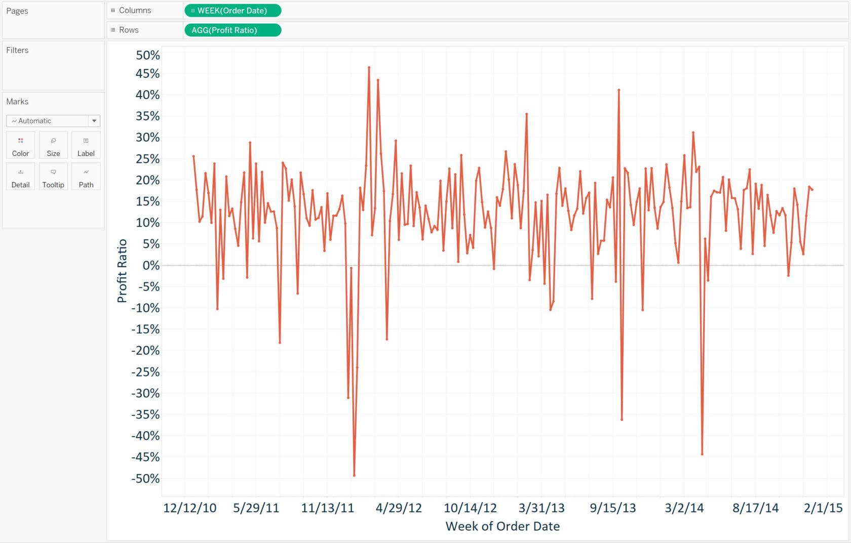
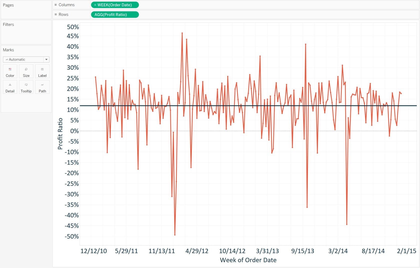
It may be concerning that we see several weeks with a negative profit ratio, but based on our historical data, is it a statistically significant cause for concern? The answer comes through control charts. Control charts start with a line that shows the mean performance for all of the data points. This is easily added in Tableau as a reference line. To add the reference line, right-click on the axis for Profit Ratio, choose “Add reference line”, and click the “OK” button. Here’s how the view looks at this point after removing the label on the reference line and formatting the line for color and weight:
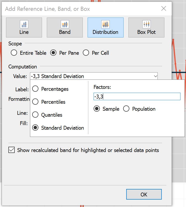
To finalize the control chart, we need to add the upper and lower control limits, which are typically three standard deviations from the mean. This step will also be accomplished through reference lines in Tableau. More specifically, a reference distribution will be used that draws two lines on the view, one for the upper control limit, and one for the lower control limit. To do this, follow these steps:
- Right-click on the axis for Profit Ratio and choose “Add reference line”
- In the reference line options listed at the top of the dialog box, choose “Distribution”
- In the dropdown for the distribution value, select the “Standard Deviation” option
- Change the factors to -3 and 3
Here’s how my final view looks after removing the line labels and doing some formatting to the reference distribution:
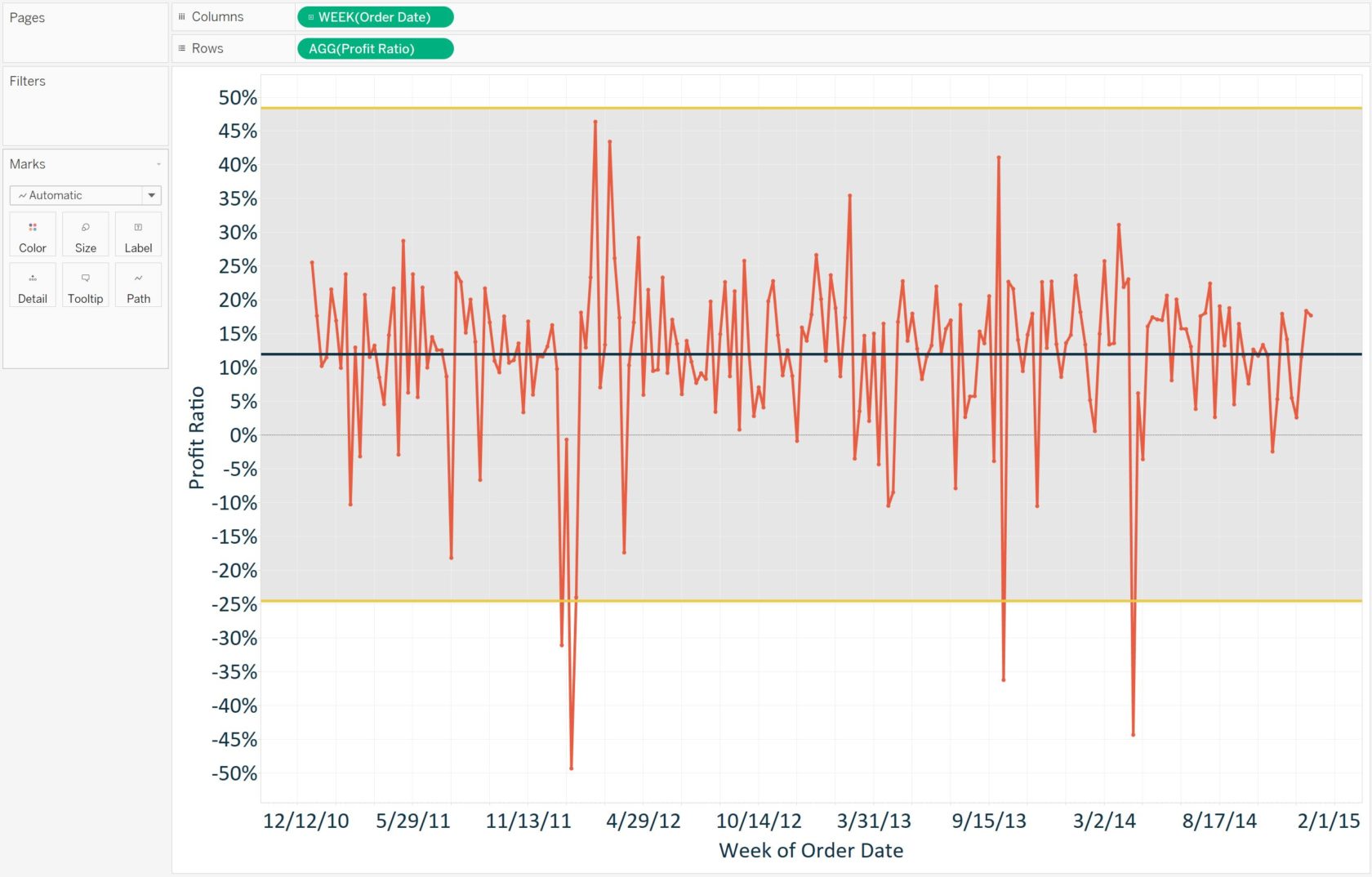
This final control chart shows not only the average profit ratio during the weeks in our analysis, but that the business can expect profit ratio to fall between -25% and 48%. In the current example, there were four weeks that fell outside of the lower control limit and deserve further investigation.
For more on this chart type, see Ben Jones’ Tableau Public post, How to Make Control Charts in Tableau.
Written By

Evolytics
This post is curated content from the Evolytics staff, bringing you the most interesting news in data and analysis from around the web. The Evolytics staff has proven experience and expertise in analytics strategy, tagging implementation, data engineering, and data visualization.