Are you ready to finally start visualizing data?
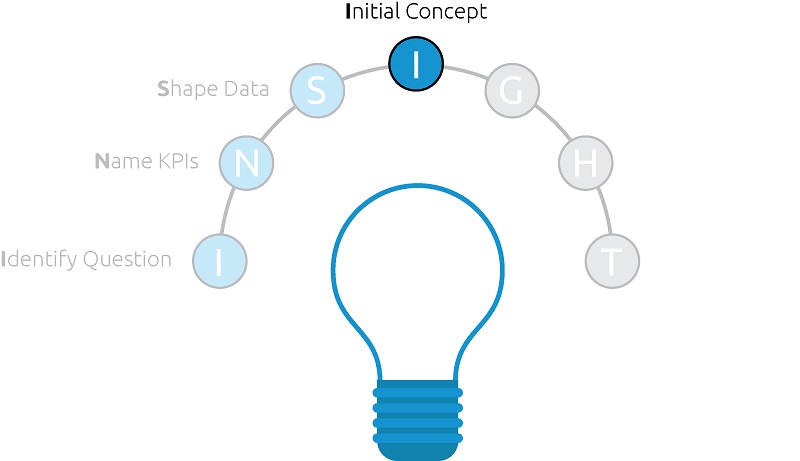
We feel like Mr. Miyagi in The Karate Kid by making us spend months “waxing on” and “waxing off” before getting to the reason we came here. The truth of the matter is the Identify Business Question, Name KPIs, and Shape Data steps in the INSIGHT framework for data visualization are the foundation required to make your visualizations as effective as possible.
They also make the visualization component itself more efficient, and dare we say fun, because these steps help reduce frustration and potential pitfalls. The strategic thinking put in during the I and N steps inform what should be included in the dashboard and the S step makes working with the data more seamless.
After this groundwork has been laid, you’re ready to create an initial concept for your data visualization.
Creating an Initial Concept
There is no single best way to create a data visualization. There are seemingly endless factors that can influence a dashboard concept, which was actually our motivation behind creating this framework to begin with.
If we had to choose the two largest factors though, we would say they are the data visualization’s (1) audience and (2) purpose.
These two factors should at least provide a starting point for what your data visualization should look like. When creating an initial concept, think about these questions:
Who is my audience?
- If the audience is fellow analysts, you may be able to provide more advanced chart types (i.e. Box and Whisker Plots, Pareto Charts, etc.)
- If the visualization is meant for a mass audience, consider simplifying the concept both in terms of layout and chart selections to make your story clearer
- If the visualization is being created specifically for a C-level audience, more weight should probably be put on boiling explicit insights to the top before diving into any in-depth prescriptive analysis
See the Data-Driven Storytelling Tip: Know Your Audience for more on this topic.
What is the purpose of the data visualization?
- We have covered this in the Identify Business Question step, as well as put some thought into answering the question in the Name the KPIs step.
- During the initial concept step, you have a chance to prioritize the KPIs in order to communicate the answer in a way that is intuitive to the end users.
See the Data-Driven Storytelling Tip: Use the Golden Ratio for more on prioritizing and laying out dashboard content.
With the answers to these two questions in mind, let’s create an initial concept in one of two ways:
- A hand-drawn sketch
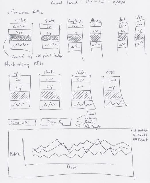
That’s right – literally draw out a concept. This is a preferred method of creating an initial concept because it is extremely efficient, and therefore you are not spending much time building or make changes. The outline, prioritization, and chart selections will come through and it will make it much easier to pivot if and when you receive feedback.
Here’s a real-life example from a project with one of our digital analytics partners:
- Exploratory
In some cases, there are certain dashboard elements that we know will be included in the final deliverable. If so, spend some time building these out and experiment with sizing, layout, and flow on a dashboard “canvas”.
When taking this approach, have an idea of how the dashboard will be distributed, which will inform the appropriate canvas size (i.e. optimized for mobile, optimized for printing, etc.).
On a blank canvas in your data visualization software, you can begin placing elements to create an initial concept before requesting critiques.
No matter which approach to creating an initial concept you choose, the key is to be open to change at this point in the process.
We recommend not investing a great deal of your effort during this step because your concept will change – which we will discuss in the next step – and you will be happy you saved your effort for later in the framework.
Written By

Evolytics
This post is curated content from the Evolytics staff, bringing you the most interesting news in data and analysis from around the web. The Evolytics staff has proven experience and expertise in analytics strategy, tagging implementation, data engineering, and data visualization.