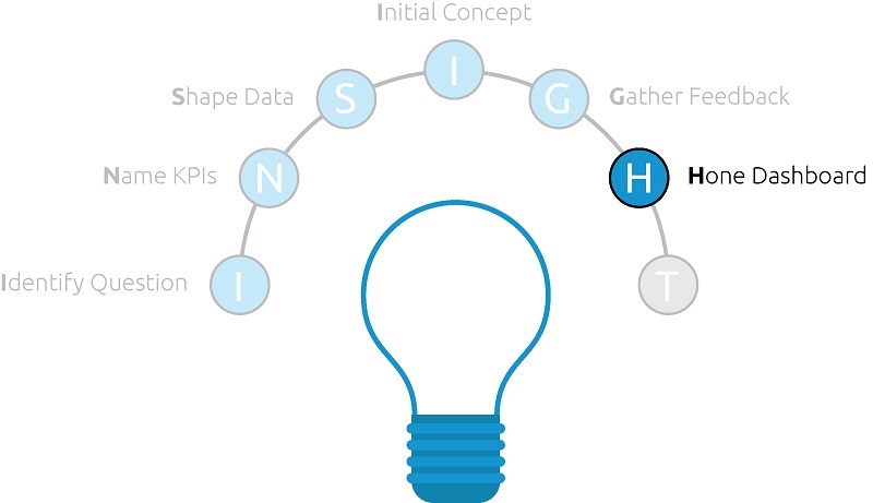
After gathering feedback from your stakeholders, you are ready to finalize your data visualization. We call this step “hone the dashboard” because you are refining your initial concept based on the audience input provided in the last step.
At this stage in the INSIGHT framework, the business question (or purpose of the data visualization), the KPIs that will be used to answer that business question, and the data set that contains those KPIs, should all be in a solid – if not final – state.
The task that is left to complete is investing the time to actually build out the components of the dashboard and lay them out. Depending on how much time you invested in the Initial Concept step, you may have quite a bit of effort left to get to a working product.
In fact, we recommended that in most situations, the initial concept should have very few working components or even none (in the case that your initial concept was a hand-drawn sketch). While this step leaves quite a bit of work to bring your concept to life, it is much more efficient because you only have to build the dashboard elements once (versus building everything only to have the audience make you move in a completely different direction).
A few general rules:
While there is no one best way to create a dashboard, here are a few general rules when trying to finalize a view:
- Dashboard dimensions should be determined by the method of distribution.
- If you know the dashboard will be printed out or attached to an email, consider making the dashboard the same size as an 8 ½” by 11” piece of paper.
- If you know the dashboard will be consumed on mobile devices, make the dashboard the same size as a tablet or mobile phone.
- If you can’t decide, the Golden Ratio is a good way to get started.
- Keep dashboard elements to 12 components or fewer.
- This is a rule we learned from Google Analytics’ limits on custom dashboards. By capping the number of dashboard elements, you keep the design focused and help the story in your data emerge more efficiently and effectively.
- If you find yourself requiring more than 12 components, consider breaking the dashboard up into multiple views or even multiple business questions.
- If you start with a descriptive overview, use interior pages to provide more prescriptive analyses.
- Keep It Simple in terms of chart selections, user experience, and design. Being clear and concise is another best-practice method for telling your data-driven story, which we will discuss in the next and final step of the INSIGHT framework.
Let’s address one of the biggest questions in any design process: What do you do if the audience feedback is conflicting or outside of data visualization best practices?
Remember, part of honing the dashboard is the opportunity to incorporate the stakeholder feedback, and there are several benefits to doing so which were outlined in the last step.
So what should you do if the audience disagrees with you or each other? Or worse, they want to create a dashboard with 15 pie charts on it?
Appealing the masses:
Ultimately, you are the final gatekeeper of the dashboard and need to prioritize which feedback makes sense and how it fits together. The designing outside of best practices question is one we have struggled with because we really do find it hard to put our name on views that are just a huge spreadsheet or include charts such as pies or packed bubbles.
Our solution is to provide the views in both ways: (1) the way that was requested and (2) the way that we recommend.
This way everybody gets what they want, and we at least have the opportunity to share the best practice approach to a specific situation.
Honing the dashboard can be an iterative step itself, so don’t worry if you don’t get it perfect on the very first try. Following the steps in the INSIGHT framework to this point will help make this step as efficient as possible, and you soon will be ready to distribute your work.
Written By

Evolytics
This post is curated content from the Evolytics staff, bringing you the most interesting news in data and analysis from around the web. The Evolytics staff has proven experience and expertise in analytics strategy, tagging implementation, data engineering, and data visualization.