This post will show you how to leverage the custom sorting function of table calculations in Tableau to visualize a reverse running total. For example, you could visualize the number of unique customers who placed an order in the last 60 days, which I will demonstrate with the most recent sample superstore data set included with version 2019.2.
Click here to view the workbook on Tableau Public.
Create an Axis Based on Customer Last Order Date
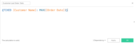
If our business question is how many unique customers placed an order in the last 60 days, the first thing we need to do is find the most recent order date for each customer. This can be done with a simple LOD calculation at the Customer Name level.
If you aren’t familiar with or need to brush up on LOD calculations, Tableau has a great whitepaper called Understanding Level of Detail (LOD) Calculations.
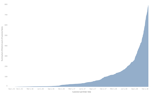
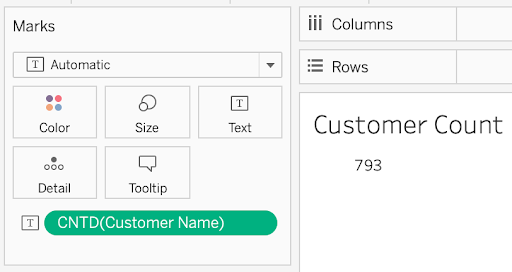
Show Customer Count by Last Order Date
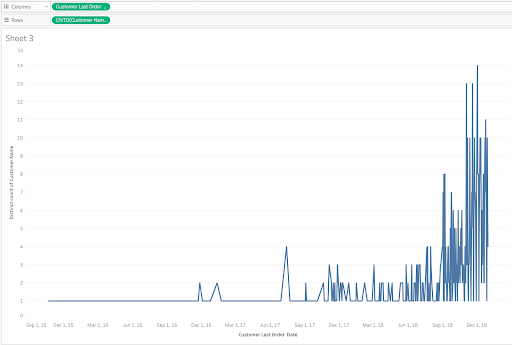
Now that we have the last order date for each customer, the next step is to visualize the number of customers at each of those dates. We first pull our new Customer Last Order Date field onto our sheet and place it on the Columns shelf, choosing a continuous axis. Next let’s pull the Customer Name field out onto our Rows shelf and make it a Count Distinct measure. You should get a chart like the following.
Create Reverse Running Total Table Calculation
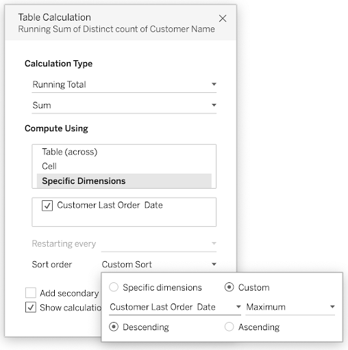
Now for the fun part, creating the table calculation. Right-click on the Customer Name field on your Rows shelf, and select a Running Total table calculation.
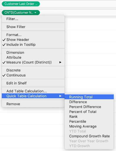
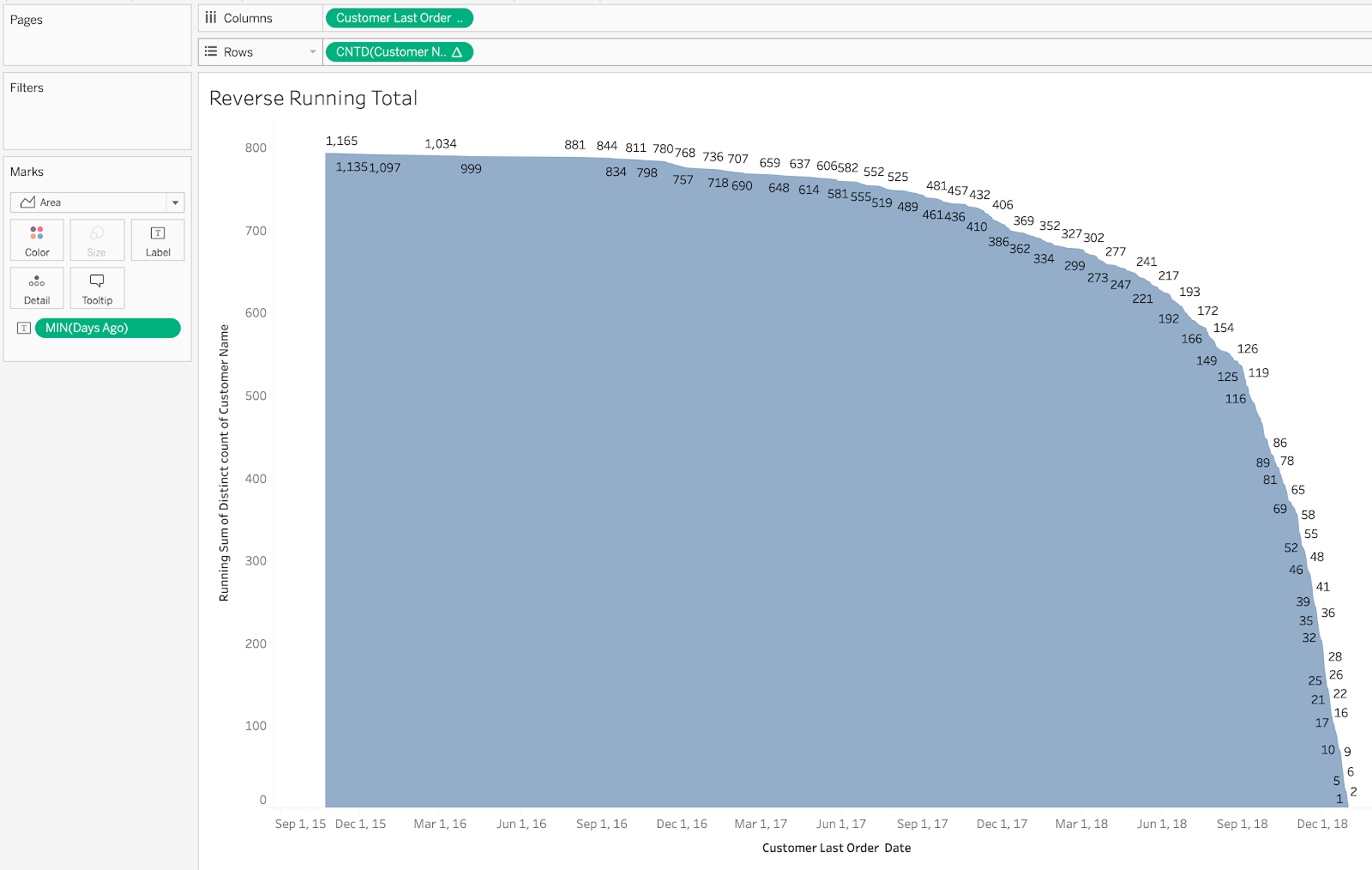
By default, this calculation will start on the left of the table and sum across, but we want it to start on the right instead, because we want to count going backwards from today.
To do this, right-click on the field again and select ‘Edit Table Calculation…’. This gives us a menu with more options to play with. Set your options according to the screenshot below –
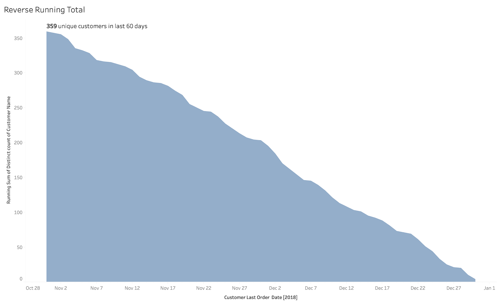
At this stage, we should get a chart like the following (I like to use an area chart here to show the direction more clearly).
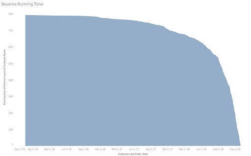
Voila! We now have our chart. Let’s make sure it calculates correctly by looking at the final value in the running sum and checking that it matches the count distinct value of customer names in our database.
Limit the View to the Last 60 Days
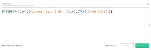
Our running total table calculation calculates from the most recent date, but our business question is to find out how many unique customers placed an order within the last 60 days. To answer this question, we need to translate the order dates into number of days from today. We can do this with the DATEDIFF function. Since this data set ends at 12/31/19, I am going to use the max order date in the set instead of TODAY() for the end date.
Let’s drag this new Days Ago field out onto our text marker to make sure it calculates correctly. We must set the aggregation to MIN() since there are multiple values per date. If we use a SUM() function and multiple customers ordered on that date, we get an incorrect value.
After checking the numbers, this looks correct, so let’s remove the field from our text mark to clean it up.
To get the count of customers placing an order within the last 60 days, we can either hover over the chart and try to find the 60-day mark, or we can create a simple filter to limit to the last 60 days.
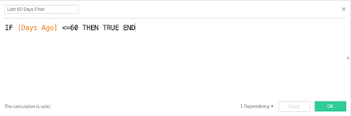
Drag this field onto the filters shelf and select True.
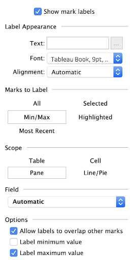
Add the Count to the Chart
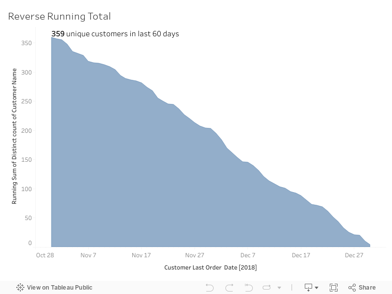
To more easily see the total count of customers, we can apply some of the finer text mark features. Click on the text marker to get the menu, and select Show mark labels, Min/Max, and then uncheck the Label minimum value box. This will just label the last day in our chart. Make sure you have removed the Days Ago label you added for QA purposes earlier before adding this step.
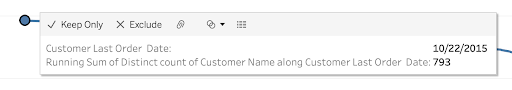
If we hover over that last mark in our chart, we see it is on 10/31/2019, which is 60 days from the last date in our database.
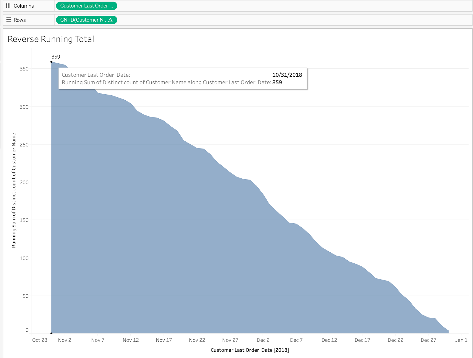
With this new view, we can answer our business question: 359 unique customers placed an order within the last 60 days.
We could’ve answered the question a little faster using a table and looking for the value on the 60th day, but if you’re stakeholder wants to explore trends and vary how many days to look back, a visual is helpful. This is another niche post that explores the finer details of Tableau, but I hope you find it helpful if you find yourself needing to create this visualization.
Final Workbook on Tableau Public
Written By

Jay Farias
Data Visualization Manager Jay Farias is a technology enthusiast who specializes in Tableau. He has years of experience implementing innovative technology solutions in the construction and healthcare industries. He supports Data Visualization strategy and implementation for Kantar Health and Intuit.