Almost every Tableau user has also been, or still is, a heavy Excel user. Being that we almost all learned Excel first, it is natural to approach a tool like Tableau for the first time with some preconceived notions about how we think it should work.
While there is some overlap between the reporting outputs of the two software programs, it can take some time to understand how the two programs differ as well as best fit together.
While there are tremendous advantages to using both programs, we have seen firsthand how learned behavior for Excel can become a barrier to adoption of Tableau.
One common such example relates to conditional formatting, and the ability to modify individual rows or columns. This is very easy to do in Excel because you can modify every single individual cell exactly as you wish.
While Tableau certainly has many encoding options available through the Marks Cards, it can seem a little “all or nothing”.
For example, if you place a measure on the Color Marks Card, then all marks on the view are colored.
This post shares a trick for formatting the marks on rows or columns independently of each other. This unlocks a great deal of formatting flexibility that is not apparent by default in Tableau.
How to Conditionally Format Individual Rows or Columns in Tableau
Before we share the trick to conditionally formatting individual rows or columns in Tableau, we would be remiss if we did not mention that we originally saw this documented by Dan Montgomery of datapsienst.blogspot.com in his post, My Favorite Tableau Trick for Work: MIN(1).
Further, we first heard about the trick from one of our Data Viz Heroes, Peter Gilks, of paintbynumbersblog.blogspot.com.
While we did not invent the approach, it was too good to leave out of Tableau 201.
Plus, one of the best things about Tableau is how the community selflessly shares innovative techniques that can be built upon or used in your own way.
To illustrate the need for this trick and provide a tutorial on how it’s used, we will be using this Tableau dashboard that is used to evaluate results for split tests on a company’s website:
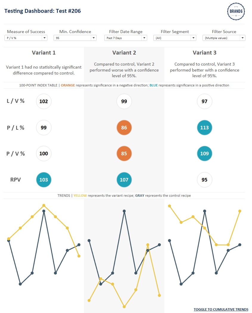
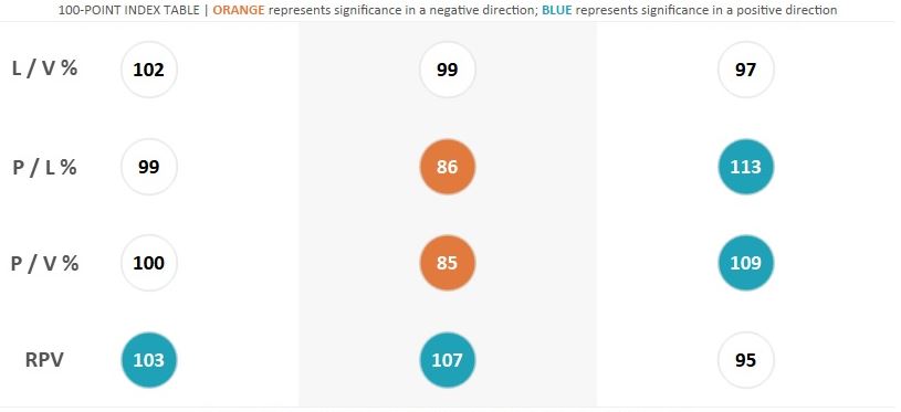
We will be focusing on the 100-point index table in the middle.
The table has a column for each variant recipe in a split test and rows for common web KPIs such as Leads / Visits Rate, Purchases / Leads Rate, Purchases / Visits Rate, and Revenue Per Visit.
The label on each circle is a 100-point index score with a score of 100 indicating the variant performed the same as the control recipe; scores above 100 indicate higher performance; scores below 100 indicate lower performance.
The special aspect of this table is that the circles are colored by whether or not the variant recipes performed differently than the control recipe with statistical significance.
There is a parameter at the top that allows the end user to choose their minimum confidence level, then statistical significance is calculated for each recipe and each KPI.
Normally to create a table with different measures, you would use the generated fields for Measure Names and Measure Values.
Here’s how this table might normally be constructed (control recipe is filtered out for consistency):
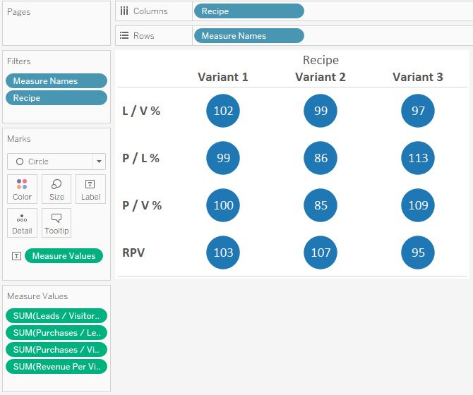
So far so good, but the issue comes when we go to conditionally color the circles for statistical significance.
With this default set-up, we can only color the circles by one field at a time.
Further, every row will be colored by that same field. So which one do we pick?
Here’s what the table looks like if we color the table by statistical significance for P / L %:
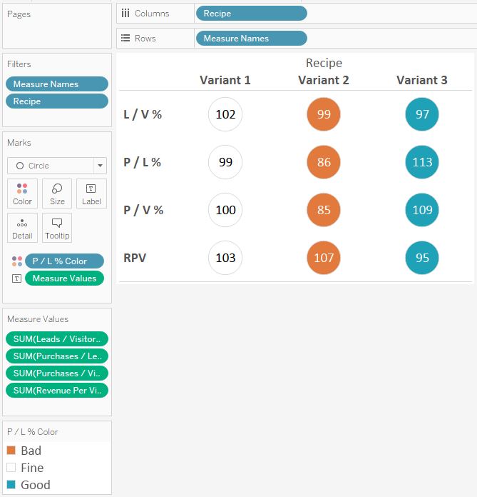
The color is correct for the P / L % row, but because the Color Marks Card is coloring every mark on the view by the same thing, all four KPI rows receive the same color treatment.
What we really want is to conditionally format each KPI row independently of each other so that the color indicators are applied only to their respective KPI.
The Solution: A Calculated ‘Placeholder’ Field
The trick for modifying the rows independently of each other is to create separate Marks Shelves for each row.
This is achieved through a simple calculated field that looks like this:
MIN(0)
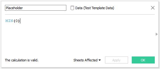
Now if the table is built with a Placeholder for each of the four rows instead of the Measure Names field, the rows can be modified independently of each other.
Here’s how our final table looks under the hood:
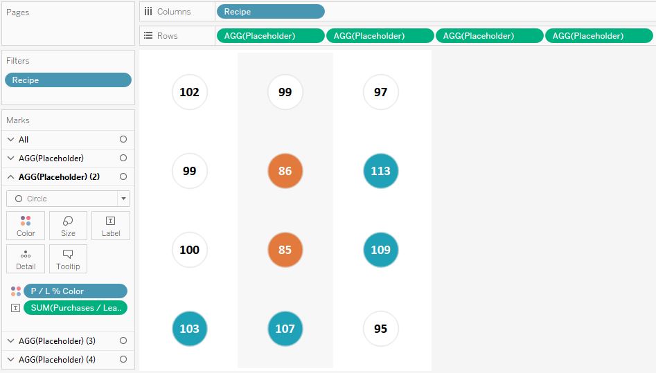
Notice that there are now four different sets of Marks Cards, one for each Placeholder field, or in this case, each KPI.
Since there are independent Marks Cards, you can independently modify each row.
This way, the P / L % row can be colored by the statistical significance for P / L %, while the row for L / V % can be colored by the statistical significance for L / V %, and so on!
Note that this example modified rows, but the same exact approach can be used for columns.
The one big drawback from this approach is that you lose the row headers, but it is fairly easy to add text boxes for each row on the dashboard as pictured above.
This is just one example of conditional formatting in Tableau, but you can format the rows with any of the options available to you on the Marks Cards.
For example, one row could be just text, while the other rows could be circles. Some rows can have different shapes. You could have different sized marks to highlight a key finding.
The list goes on and on…
Written By

Evolytics
This post is curated content from the Evolytics staff, bringing you the most interesting news in data and analysis from around the web. The Evolytics staff has proven experience and expertise in analytics strategy, tagging implementation, data engineering, and data visualization.