
The Marks Cards in Tableau provide some of the most powerful functionality in the program because they allow you to modify a view’s design, visualization type, user experience, and granularity of analysis all in one place.
This post provides an overview of the Marks Cards available in the authoring interface as well as an introduction to the concept of a view’s level of detail.
In the Fundamentals post, Getting a Lay of the Land, you saw that the default location of the Marks Shelf (or Shelves), which contain the Marks Cards, are located on the left side of the view to the right of the Dimensions Shelf and under the Filters Shelf.
The Marks Shelf and Marks Cards include the word ‘marks’ because they change the marks, or data points, on a view.
An Explanation of Level of Detail
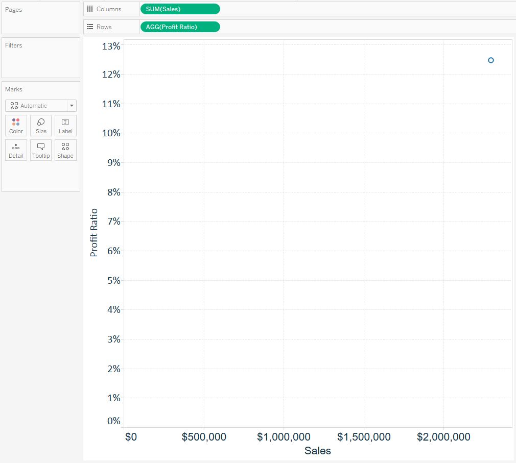
To help illustrate how each Marks Card impacts the marks on a view, we will be using this simple scatter plot looking at Profit Ratio and Sales:
As you can see on the Marks Shelf, there are six different Marks Cards: Color, Size, Label, Detail, Tooltip, and Shape.
Note that the Shape Marks Card is not available for every view, but appeared because we are creating a scatter plot in this example.
To help explain what each of these cards does, we are going to start a little out of order and discuss the Detail Marks Card.
We are starting with the Detail Marks Card because level of detail is a critical aspect of analyzing data in Tableau, but it took us a while when we started using Tableau to realize its importance.
It’s not a difficult concept, but just one of those that wasn’t explained early on. Once you wrap your head around the topic of level of detail, your authoring in Tableau will feel much more fluid and it will be easier to use the popular Level of Detail expressions functionality.
The first thing you need to know is that every visualization has a level of detail.
It helps us to think about level of detail as the most granular level where the analysis takes place.
Consider the scatter plot pictured above. At this point, we are not slicing and dicing the Profit Ratio and Sales measures by any dimension. For that reason, you see just a single mark, which represents the intersection of Profit Ratio and Sales for every record combined in the Sample – Superstore data set.
As you add dimensions to the view, the analysis becomes more granular, so the level of detail changes.
For example, if we wanted to do this Profit Ratio versus Sales comparison at the customer level, we can drag and drop the Customer Name dimension from the Dimensions Shelf to the Detail Marks Card, which results in the following:
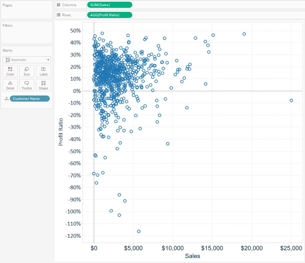
We have changed the most granular level of the analysis from the entire file to customer.
Another handy feature of Tableau is you can look in the bottom left-corner of the worksheet for a summary of the view. When we changed the level of detail for this scatter plot, the mark count changed from 1 (the entire file) to 793 (the number of customers).
Note that adding dimensions in other places on the view will also change the level of detail, but the Detail Marks Card is available to make the analysis more granular if needed.
An Introduction to Encoding
The Color, Size, and Shape Marks Cards all allow you to “encode” the marks on a view.
Encoding marks adds depth to an analysis by mapping marks to colors, sizes, and / or shapes to add context to a view.
Here’s how the scatter plot view looks if we put Segment on the Color Marks Card, Sales on the Size Marks Card, and Category on the Shape Marks Card:
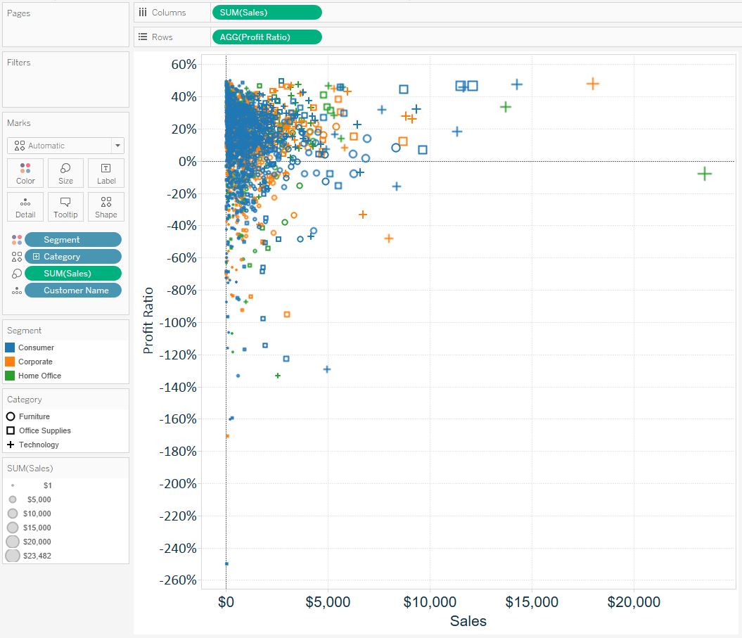
There are now three different legends corresponding with the encoding that was just added.
For consistency, this encoding will conveniently carry through on other views as they are created. For example, if we color a new view by the Segment dimension, Consumer will still be identified as blue, Corporate will still be identified as orange, and Home Office will still be identified as green.
These colors can be changed by clicking on the color legend and mapping new colors.
These three Marks Cards can also be used to change all the marks on the view instead of mapping to a specific dimension.
Instead of placing a dimension on the Marks Cards, click each card to experiment with changing the color, size, or shapes for all of the marks at the same time.
Simple changes to the Marks Cards can substantially improve the design of a data visualization.
Label and Tooltip Marks Cards
The Label and Tooltip Marks Cards can both be used to add written information to a view. The difference is that whatever information is added as a Label will show up on the view itself, while any information added to the tooltips will only show up when an end user hovers over marks on the view.
This is an important distinction that should be considered when you are authoring in Tableau.
For example, if your visualization will be printed or copied and pasted as a screenshot, you would want to add the information to Label to ensure the information is shown on the view. On the other hand, if you know your end users will be interacting with Tableau, you may opt to save some on-screen real estate by providing the information through tooltips.
As with the other Marks Cards, labels and tooltips can be customized with specific information by dragging and dropping fields onto the Label and Tooltip Marks Cards, respectively. You can click into each of these two Marks Cards to toggle them on and off, change the formatting, and even type in additional information.
The six Marks Cards introduced in this post can dramatically improve the depth, design, and user experience of your visualizations.
Utilizing this functionality will not only help your analyses, it will make your final product more effective with end users.
Written By

Evolytics
This post is curated content from the Evolytics staff, bringing you the most interesting news in data and analysis from around the web. The Evolytics staff has proven experience and expertise in analytics strategy, tagging implementation, data engineering, and data visualization.