Histograms are one of the most effective chart types for showing a distribution of quantitative data at one point in time. Similar to a bar chart, the important distinction is that histograms are used to plot continuous, numerical data while the bar chart is used to plot discrete, categorical data. When you create a histogram, bins are created to group equally-sized numerical ranges. Despite being continuous and quantitative, these bins can be thought of as the dimension that you slice and dice the count of records by to create the histogram.
How to Make a Histogram in Tableau
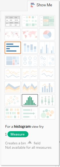
Histograms are one of the 24 chart types in Tableau that can be created using the Show Me tool in the top right corner of the Tableau Desktop interface. We usually like to explain how a visualization is created manually in Tableau instead of relying on Show Me, but histograms are one of my few exceptions. Histograms are created in Tableau using just one measure. To create a histogram, pre-select the measure that you want to visualize the distribution for by clicking on it in the Measures Shelf. Then navigate to the Show Me options and choose “histogram”.
Here’s how a histogram looks if you follow the steps above for the Quantity measure in the Sample – Superstore data set:
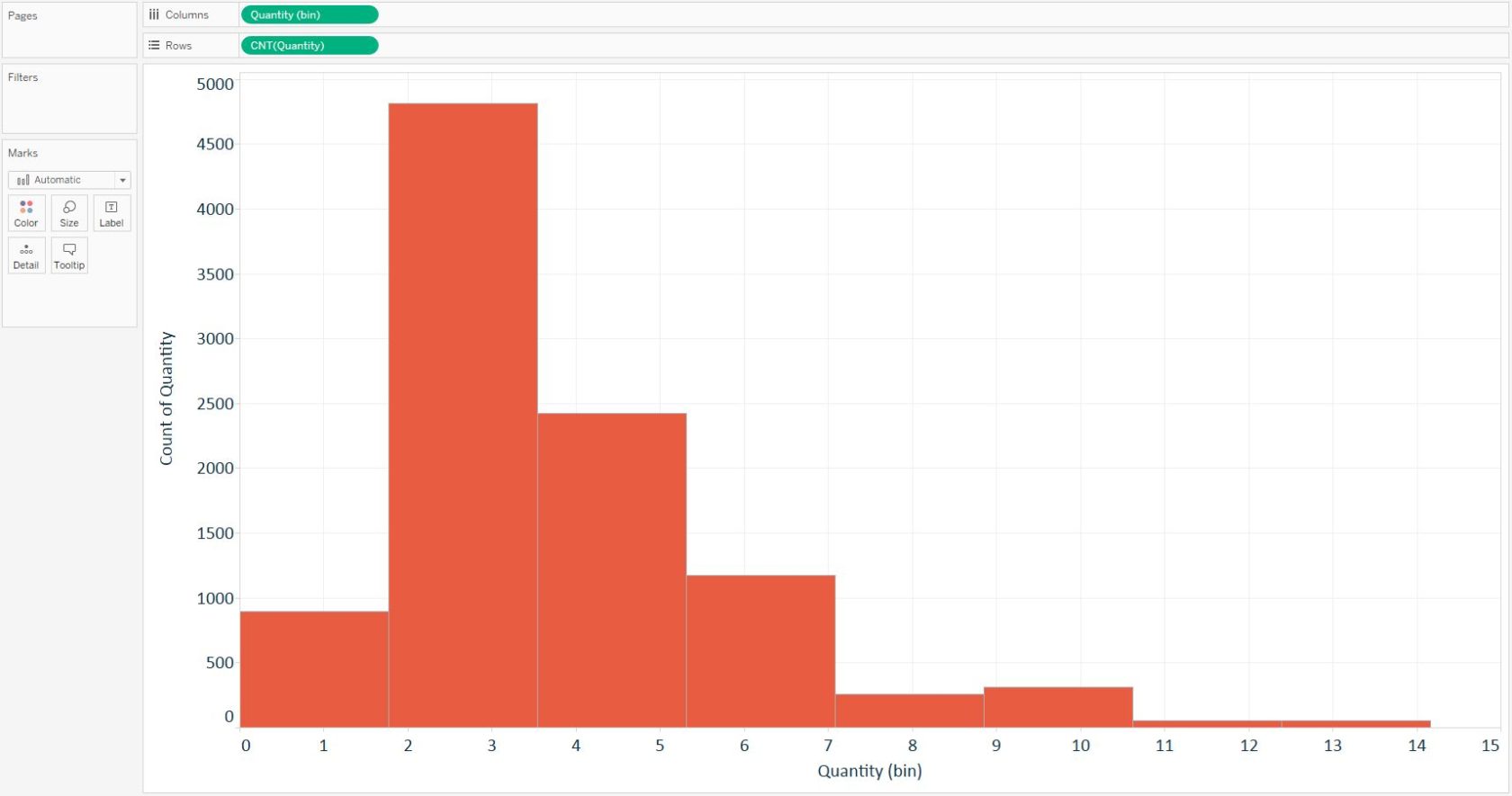
When this chart was created, Tableau conveniently created the dimension for “Quantity (bin)” to provide the equally-sized ranges which are required to create a histogram. The bars then represent the count of records within each of these ranges. Notice that the bars have no space between them; this is how some authors like to differentiate the bars with continuous data in a histogram from the bars with categorical data in a bar chart.
Depending on how the distribution looks, you may choose to change the size of the bins. This is easy to accomplish by locating the newly created Quantity (bin) dimension on the Dimensions Shelf, right-clicking on the field, and choosing “Edit”. A new interface will appear that shows you the current bin size and allows you to change the equal ranges:
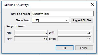
Here, you can either type in a number, or click the dropdown arrow to have the bin size be based on a parameter. Let’s say for simplicity that we want to change the bin size for the quantity measure to one. This analysis would show the end user how many records (i.e. sales) included one item, two items, three items, and so on. Here’s how the histogram looks after editing the bin size:
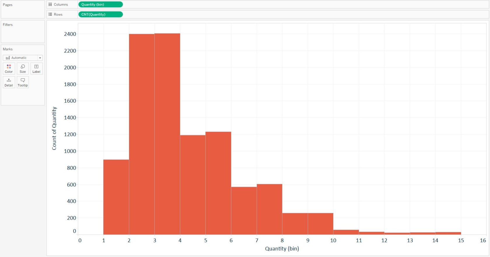
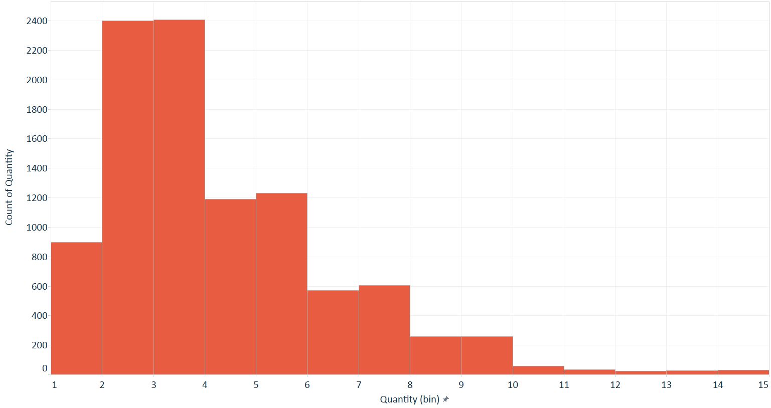
Lastly, because the bin ranges are continuous, we have a continuous axis that begins at zero and ends at one bin past our maximum bin size. If you need to change the axis range, right-click on the X-axis and choose “Edit axis…”. Here is how the final histogram for quantity looks after fixing the axis range from 1 to 15:
Written By

Evolytics
This post is curated content from the Evolytics staff, bringing you the most interesting news in data and analysis from around the web. The Evolytics staff has proven experience and expertise in analytics strategy, tagging implementation, data engineering, and data visualization.