The Box-and-Whisker Plot, or Box Plot, is another effective visualization choice for illustrating distributions. Along with histograms and stacked area charts, Box-and-Whisker plots are among my favorite chart types used for this purpose. They work particularly well when you want to compare the distributions across two different dimension members side-by-side, where one set of dimension members make up the X-axis, and the other dimension member is used as the visualization’s level of detail. To help illustrate, here’s the box-and-whisker plot we will create with the Sample – Superstore dataset during this tutorial:
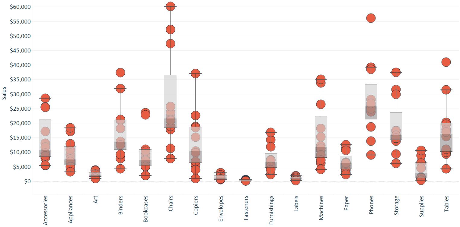
As you can see, each set of circles corresponds to the dimension members on the X-axis for the Sub-Category dimension. The level of detail, or most granular level of the analysis, is Month of Order Date. Since the level of detail is month of order date, each Sub-Category column has 12 circles, one for each month of the year.
In short, this visualization is showing how the distribution of monthly sales vary between product sub-categories. While we can easily find several insights in this visualization and believe box-and-whisker plots to be among the most effective ways to communicate distributions, we find them to be one of the most misunderstood chart types when we attempt to share them with an external audience.
For this reason, this post shares not only how to make Box-and-Whisker Plots in Tableau, but how to read them.
How to Make a Box-and-Whisker Plot in Tableau
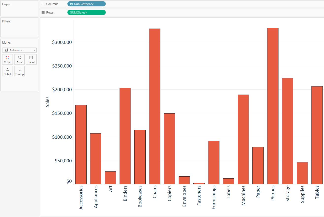
Box-and-Whisker Plot is one of the out-of-the-box Show Me options in Tableau, but they are actually created with reference lines – which is what we’ll show here. To create a box-and-whisker plot, start by creating a bar chart with the dimension and measure of interest. In the example above, we are looking at Sales by Sub-Category.
Next, add the distribution that you care about to the Detail Marks Card. In this case, we are looking at how Sales are distributed by Sub-Category, by Month of Order Date. So in this example, Month of Order Date is added to the Detail Marks Card.
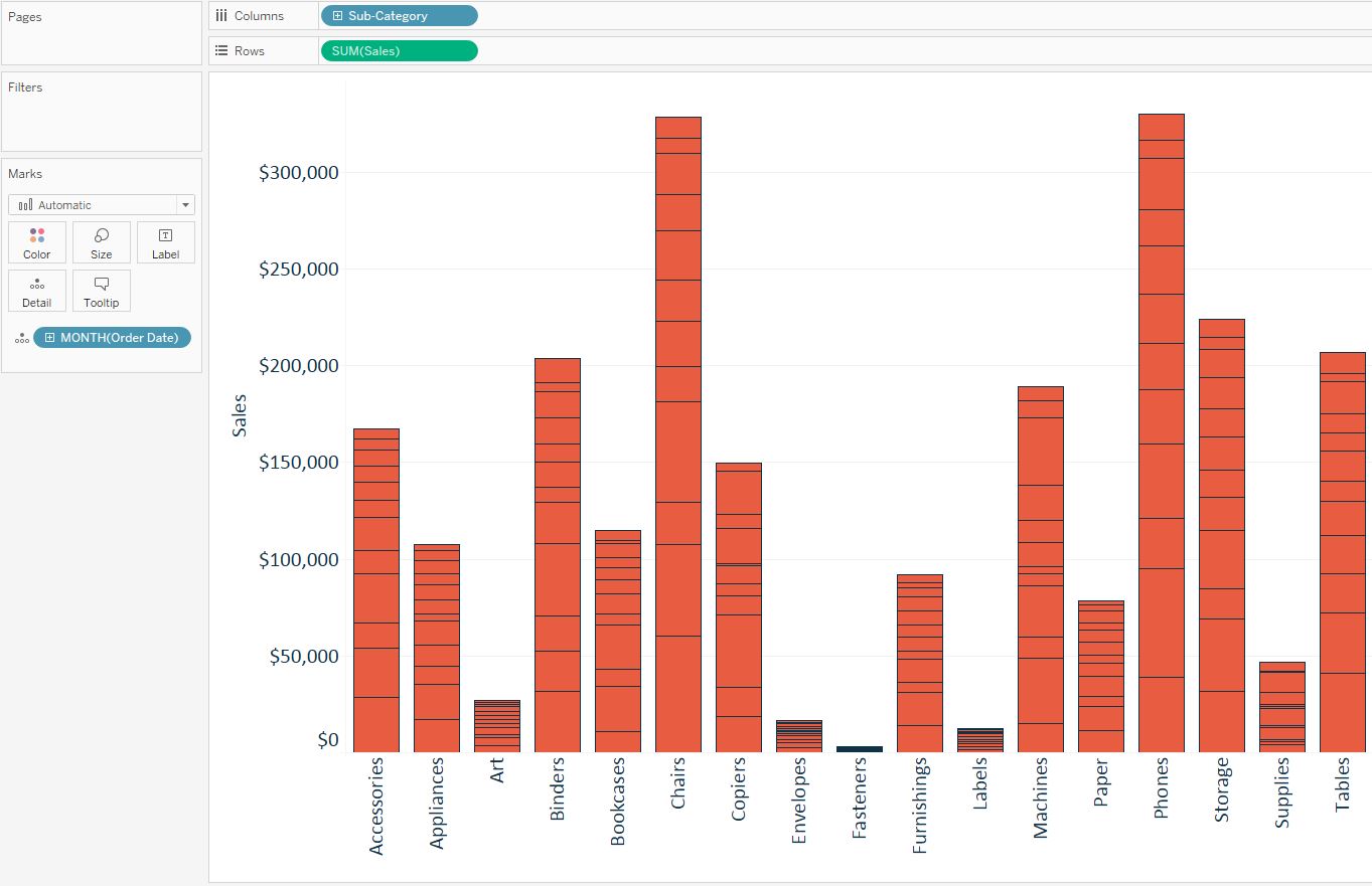
By increasing the level of detail, a stacked bar chart is created, with each stack per sub-category representing one of the twelve months of the year. To set the foundation of the box-and-whisker plot, convert this stacked bar chart to a dot plot by changing the mark type from Automatic (Bar), to Circle.
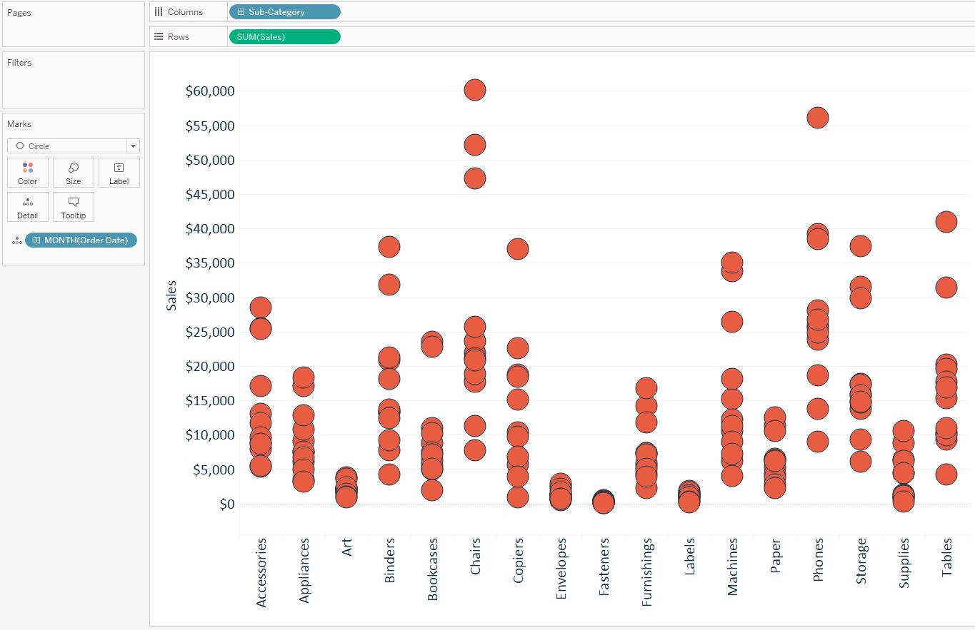
Lastly, to create a box-and-whisker plot, right-click on the Y-Axis, and choose “Add Reference Line”. When the add reference line dialog box appears, click on the choice for Box Plot. There are some formatting options available, but the default settings are usually best:
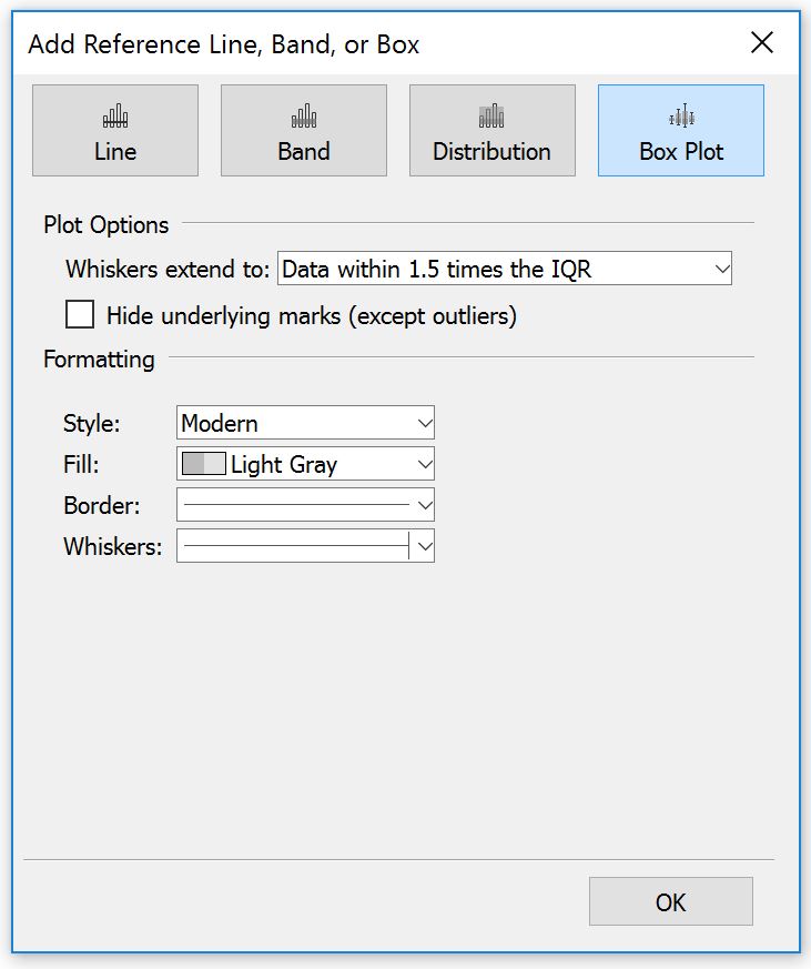
IQR stands for Interquartile Range, which are the data points between the first and third quartile. So the default options are telling Tableau to make all of the data points on the box-and-whisker plot fit into 1.5 times the IQR; anything outside of that range is an outlier. This sounds confusing and is probably why we don’t see this chart type getting much traction, but this chart type provides a lot of helpful context and is easy to read once someone explains it to you. Let’s take another look at the final box-and-whisker plot from this tutorial:
How to Read a Box-and-Whisker Plot
Each line on the box-and-whisker plot provides a piece of statistical context. The most important line is the one right in the middle of each “box”, which represents median. With median displayed, you can quickly look across the dimension members and compare medians, regardless of how big or small the range of values is within each column.
That alone is very useful for an analysis, but the rest of the lines also have a meaning. Working out from the median, the next set of lines is showing plus or minus one quartile from the median.
Lastly, the upper whisker is 50% higher than the IQR, or “middle fifty”, which are the data points within the first and third quartile. The lower whisker is 50% lower than the IQR. Any data points outside of the box-and-whisker are considered outliers.
Now not only can you make a box-and-whisker plot in Tableau, you know how to use them to get the most out of your analyses!
Written By

Evolytics
This post is curated content from the Evolytics staff, bringing you the most interesting news in data and analysis from around the web. The Evolytics staff has proven experience and expertise in analytics strategy, tagging implementation, data engineering, and data visualization.