How to make sparklines is the first of a three-part post from “Use Corporate Chart Types”, tip nine in the Data-Driven Storytelling: Tips from an Iron Viz Champion series.

Sparklines are condensed graphs or charts that can be used in-line with text or grouped to show trends across several different measures. The term sparkline was introduced by Edward Tufte, a data visualization pioneer, and proponent of the chart type.
Sparklines are typically so small that the chart itself usually does not contain familiar context that you would find in a full-size chart, such as axes. Despite this limitation, we find sparklines to be one of the most effective corporate chart types for quickly communicating trends across KPIs.
After all, you can always provide context in the surrounding text, and if you are using Tableau, context can be added through other approaches such as tooltips (the information that appears when you hover over a data point).
It is very common for sparklines to be a foundational piece of the corporate dashboards we create. They are a great place to guide an end user to start, so we usually place sparklines in a prominent area of our dashboards, such as down the left side.
For more on dashboard layout and design, see tip five in the data visualization tips series, Use the Golden Ratio.
How to Make Sparklines in Tableau
Sparklines are easy, and (dare we say?) fun, to create in Tableau.
If you would like to follow along, we are using the Superstore sample dataset that comes out of the box with Tableau.
To get started, you will leverage two special fields in your data, Measure Names and Measure Values.
These fields are automatically generated in your data by Tableau so they will be available to use even though they do not exist in your underlying data.
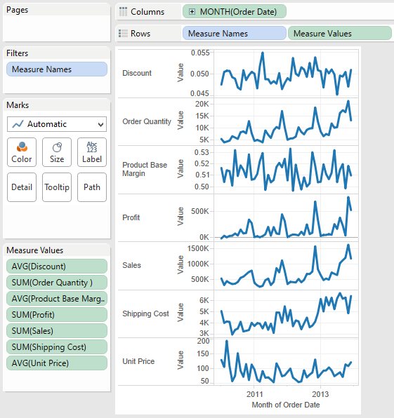
Step 1 – Place ‘Measure Names’, then ‘Measure Values’ on your ‘Rows’ shelf.
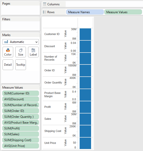
Notice that every measure name appears in your chart, whether it is relevant to your analysis or not – more on filtering out specific measure names later. Since you placed ‘Measure Values’ on your view as well, each measure name has an accompanying value, shown by default as a bar in each measure’s default aggregation (i.e. SUM, AVG, etc.). We have also changed the view’s fit to “Fit Height” so that we can see all of the measure names and values without scrolling.
This is a good start, but now we need an element of time to trend the measure values.
Step 2 – Place a date field on the ‘Columns’ shelf.
By right-clicking and dragging my ‘Order Date’ field onto the ‘Columns’ shelf, we are given an extra option to select the date aggregation (i.e. Year, Month, Week). To get the view to look as it does below, choose the ‘MONTH’ option that was colored green. The green indicates that the date will be continuous.
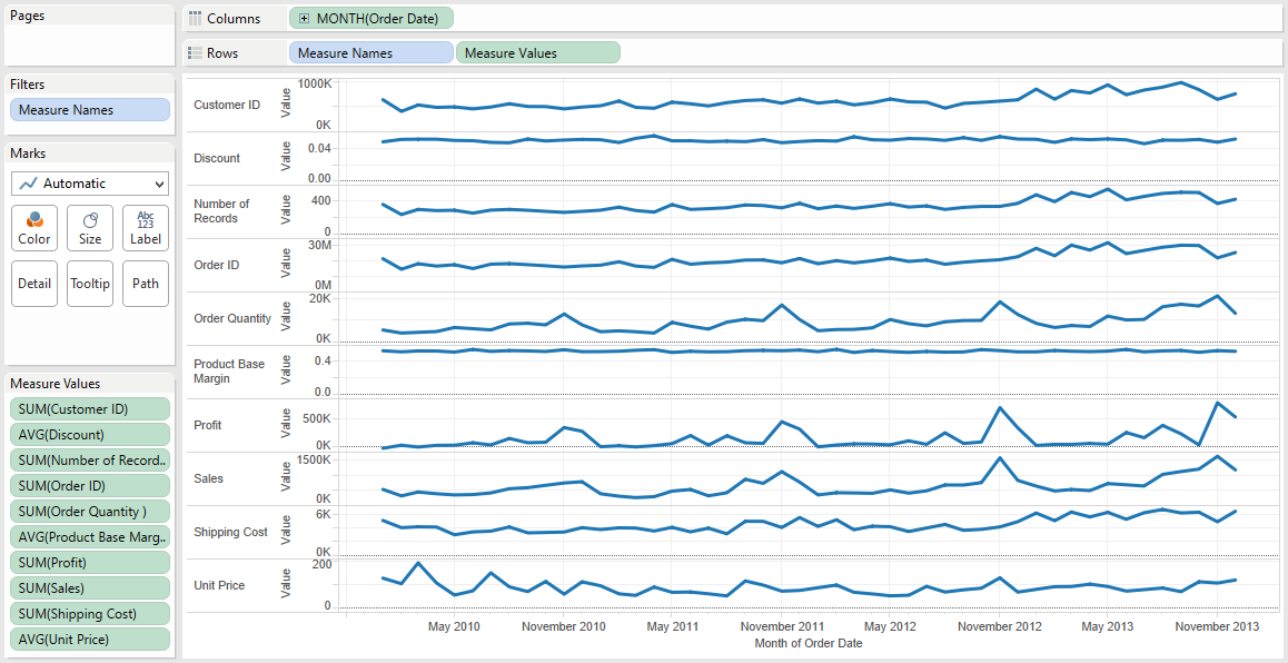
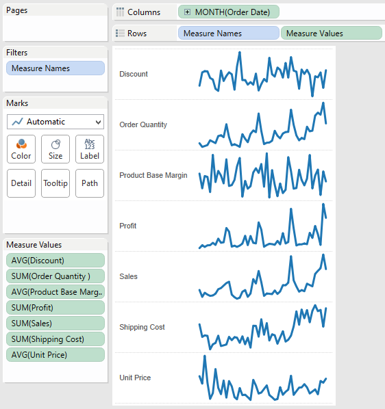
We have now essentially made a series of line graphs, but they are not very ‘sparky’, making it difficult to quickly glean insights. This is an easy fix in Tableau by clicking and dragging the right side of the graph to the left to reduce the width of the view.
Step 3 – Reduce the width of the sparklines view to make the trends pop.
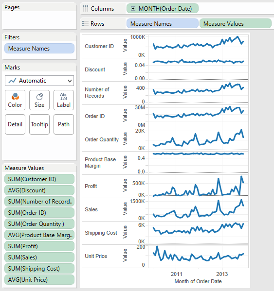
You can see at this point that the sparklines are coming together, but as previously mentioned, we have some irrelevant measure names that are not adding much to our analysis.
Step 4 – Remove irrelevant measures from your view.
For the purposes of this analysis, we removed three measures by dragging their green ‘pill’ from the ‘Measure Values’ shelf. The three values removed were ‘Customer ID’ and ‘Order ID’, which should actually be dimensions and not measures, and ‘Number of Records’, which is another generated Tableau field.
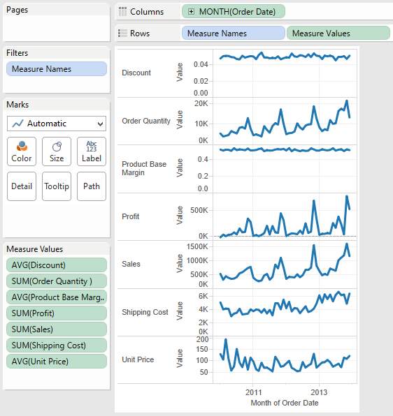
We’re getting even closer now, but notice that ‘Discount’ and ‘Product Base Margin’ are not providing much insight because these two measures have very little fluctuation. For this reason, we typically remove zero from my axes in sparklines.
There is much debate around whether it is ever appropriate to exclude zero from your axes, because it is easy to mislead your audience when an axis starts anywhere but zero.
In the case of sparklines, and measures with little to no volatility, we recommend either excluding zero on the axes, or removing these types of measures completely from your view. We say this because if you cannot gain any insight from these measures in your sparklines, they are not adding any value.
Step 5 – Exclude zero from your axes or remove measures that have little to no fluctuation.
To do this in Tableau, right-click on any of the axes in your sparklines and choose “Edit Axis”. You will see a box specifically created to give you the option to include or exclude zero in your axes. By default, the box to “Include zero” is checked. To exclude zero, uncheck this box.
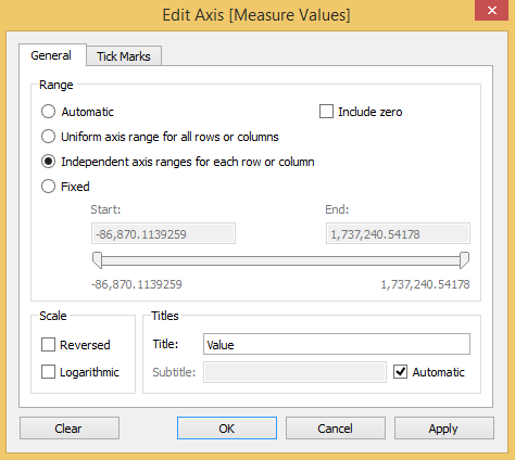
You can now see the fluctuation in ‘Discount’ and ‘Product Base Margin’.
From here, all that’s left is to format the sparklines to your preference. Remember, sparklines are not quite like regular charts or graphs in that they are meant to provide quick trends at a glance. They don’t usually contain typical context, such as the axis values.
Step 6 – Hide axes and format your view
Formatting changes made to finalize this view include:
- Hid the Y axis by right clicking on the axis and deselecting “Show Header”.
- Hid the X axis.
- Some prefer to keep the axis that shows the date range.
- We excluded this from the sparklines, but if you need to show it, we recommend only showing the start and end points.
- Removed the gridlines.
- Removed the column separators.
- Softened the row separators by choosing a dotted line instead of a solid line.
Final considerations
The sparklines pictured above can definitely stand on their own and provide a great deal of insight and a starting point for any dashboard.
That being said, Tableau allows you to customize from here in many different ways. For example, you may choose to show labels for the minimum and maximum values for each sparkline. This approach provides an alternative to showing the Y axis because it shows the end user how low and high the axis goes.
You can also customize the tooltips to provide additional context such as the exact values and dates that the end user is viewing.
Written By

Evolytics
This post is curated content from the Evolytics staff, bringing you the most interesting news in data and analysis from around the web. The Evolytics staff has proven experience and expertise in analytics strategy, tagging implementation, data engineering, and data visualization.