
When used properly, donut charts can be an effective way to communicate comparisons in a unique way. When used improperly, they are the butt of jokes mentioned in the same vein as pie charts.
In fact, donut charts are essentially pie charts with a circle in the middle, and in our data visualization tips series, we explain why you shouldn’t use pie charts.
So what’s the difference with donut charts?
One of our recommendations for practitioners that cannot quite let go of pie charts is to use five slices or fewer, we tend to use no more than two.
When used for the specific purpose of showing a metric’s progress to goal, with one “slice” being the current state of the KPI and one “slice” being the remainder to goal, we think a donut chart works well.
We admit, a bullet graph would be the most efficient way to communicate the progress to goal scenario above.
In other words, a bullet graph would be processed faster by end users than a donut chart and also take up less real estate on a dashboard.
If you think a bullet graph may be a more appropriate choice for your data visualization, see How to Make Bullet Graphs in Tableau.
That being said, we don’t mind the extra real estate that a donut chart takes up because that space can be used to provide additional context in a visually appealing way.
For example, you can place an icon that denotes what the donut chart applies to or a callout number that shows the percent your KPI has progressed to goal. Donut charts are an acceptable alternative chart type that can make your data visualization stand out.
For more on making your work ‘remarkable’, see tip twelve in our Data-Driven Storytelling series, Balance Data and Design.
How to Make Donut Charts in Tableau
Step 1
For the purposes of this exercise, we will make a gauge showing how our sales are progressing towards goal. We are using the Superstore sample data in Tableau. This data already contains a measure for ‘Sales’, but we will need to create one more field that calculates the sales goal minus the actual sales.
The data you are working with may contain a measure for ‘Sales Goal’, but we are going to hard code a goal of $80,000,000 into my calculated field: $80,000,000 – SUM([Sales]).
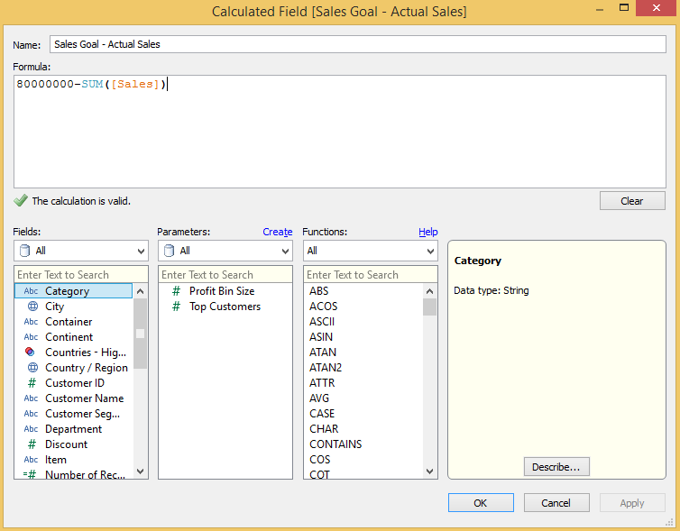
The reason we make this calculated field is so the two slices in our donut chart will always add up to the total goal, and actual sales will always by a correctly sized portion of the total goal.
Step 2
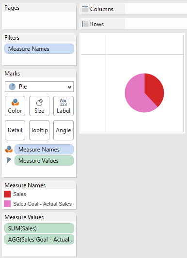
You will now create a pie chart using two measures: ‘Sales’ and the newly created ‘Sales Goal – Actual Sales’.
Do this by first changing the mark type on your view to Pie.
Now place ‘Measure Names’ on the Colors marks card and ‘Measure Values’ on the Angle marks card.
Finally, filter the view on ‘Measure Names’ to only include ‘Sales’ and ‘Sales Goal – Actual Sales’. At this point, your view should look like this:
Step 3
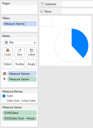
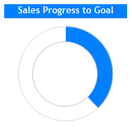
Format the donut chart (currently a pie) by increasing the size, adding a border, and most importantly: coloring the ‘Sales’ measure to a color of your choice and the ‘Sales Goal – Actual Sales’ measure white.
This will eventually create the filling gauge effect we are going for.
Step 4
The final step in creating a true donut chart is to ‘poke a hole’ in the chart we have created so far by adding a circle to the middle. We have two approaches for this final step.
Approach 1: Single Sheet
For most situations, this first approach will be the most elegant solution.
- Start by creating a calculated field called “Placeholder” that has this formula: MIN(0)
- Create a Dual-Axis Chart by placing this new calculated field on the Rows Shelf, then adding it again to the opposite axis. At this point, our view looks like this:
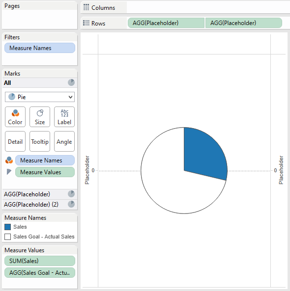
Notice that there are now two different Marks Shelves – one for each Placeholder field. That means that you can now edit the marks for each field independently of each other.
On the Marks Shelf for the first placeholder, leave the settings as is with a mark type of pie – this is our original chart and we don’t want to change it.
On the Marks Shelf for the second placeholder field, change the mark type to circle, which will become the hole in the donut chart.
Reduce the size and change the color of the circle as desired. You can also modify the marks for the second placeholder further by adding in a label, etc. At this point, our view looks like this:
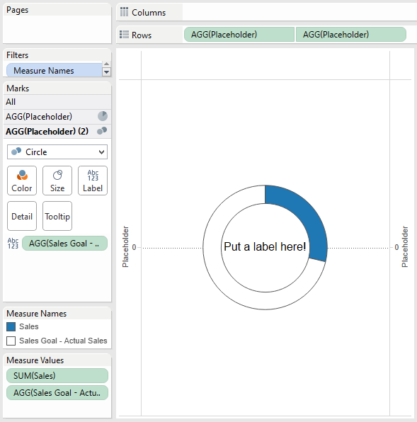
Finally, clean up the view by doing some simple formatting such as hiding zero lines and headers.
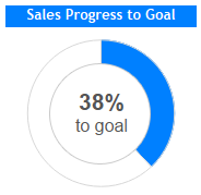
You now have a donut chart that is comparing sales to sales goal.
You can take this a step further by adding a dimension to the Columns shelf to create a small multiples view that compares performance across several different dimension members (i.e. Region, Segment, etc.).
Approach 2: Floating Sheets
If your visualization requires icons or additional graphic design, as is the case in the Your Salary vs. a MLB Player’s Salary viz, we recommend you float a .png image over the chart.
It is very important that you use a .png file so that your corners are transparent and you will be able to see the underlying chart.
Feel free to use this .png file for your inner circle if you don’t already have one.

Finally, we mentioned earlier that we don’t mind donut charts because the real estate available in the inner circle can be used to communicate additional context either through icons or text.
If you’re using approach 1, you can create a calculated field that determines the percentage of sales goal obtained, and then add this calculated field to the label of the placeholder 2 marks card.
If you’re using approach 2, you can enhance the .png image shared above with your own icons or other design elements.
If you would like to use a calculated field to show progress to goal, you can create a sheet with that metric and float it over the chart and .png image.
In either approach, your final product will end up looking like this.
Written By

Evolytics
This post is curated content from the Evolytics staff, bringing you the most interesting news in data and analysis from around the web. The Evolytics staff has proven experience and expertise in analytics strategy, tagging implementation, data engineering, and data visualization.