
As an analysts, the ‘Stoplight’ 100-point index is a reporting mechanism that we cannot live without.
If you are not familiar, the 100-point index is a simple way to know whether a measure is outperforming or underperforming a comparison measure, with the comparison measure typically being a goal or the performance during a prior period.
An index score of 100 means that the measure in question matches the comparison measure; a score greater than 100 indicates the measure is outperforming the comparison; a score less than 100 indicates the measure is underperforming the comparison.
This post shares three ways for getting the most out of 100-point index scores in Tableau: how to set-up a 100-point index, how to make a custom color palette to be used in a Stoplight 100-point index highlight table, and a trick for how to handle reverse 100-point index scores (when outperforming the comparison means a negative impact on the business).
What is a Stoplight Index?
A stoplight index enhances the traditional 100-point index score by encoding the scores by color for faster processing.
This is essentially a highlight table with 100-point index scores for different measures.
Outperform the comparison (i.e. a score >= 100) and the indicator is green; come close but fall just short (i.e. the score is between 90 and 99) and the indicator is yellow; underperform goal or prior period (i.e. a score < 90) and the indicator is red.
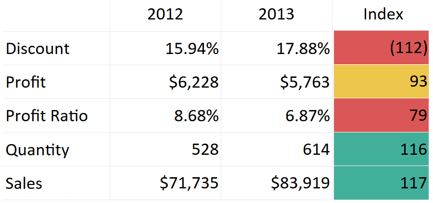
Here is an example showing a year over year index. For the purposes of illustration, this is the Sample – Superstore data with filters for year (keeping only 2012 and 2013) and Sub-Category (keeping only Chairs):
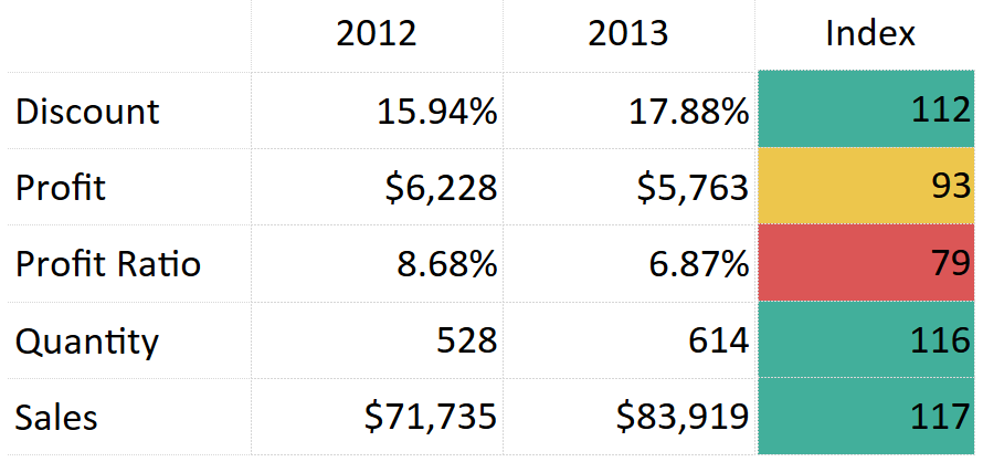
Note that Discount, Quantity and Sales were all up year over year, so they are colored green. Profit was down year over year, but still within 10%, so it is colored yellow. Profit ratio is down more than 10% year over year, so it is colored red.
Why do I have to use the fancy approach you’re about to share?
If you’re used to working in Tableau, your first instinct to get the desired color encoding shown and described above would be to make a calculated field, similar to this:
IF [Measure 100-Point Index] >= 100 THEN “Green”
ELSEIF [Measure 100-Point Index] < 100 AND [Measure 100-Point Index] >= 90 THEN “Yellow”
ELSE “Red”
END
You would then place this calculated field on the color marks card to encode the value.
This approach would work for each individual measure, but not if you are wanting to show more than one KPI at a time.
It’s also a relatively manual approach because you would have to recreate these color instructions for every single measure.
This approach would be much easier if you were able to use the Measure Values field in calculated fields, but that functionality is not currently available.
How to Set Up a 100-Point Index
There are always multiple ways to accomplish the same objective in Tableau, and each approach tends to have its own pros and cons.
We are going to demonstrate how to set up 100-point index scores using table calculations, which have a major pro of being one of the fastest ways to set up calculated fields, but can be tricky to work with if you lose track of the direction that the table calculation is being calculated.
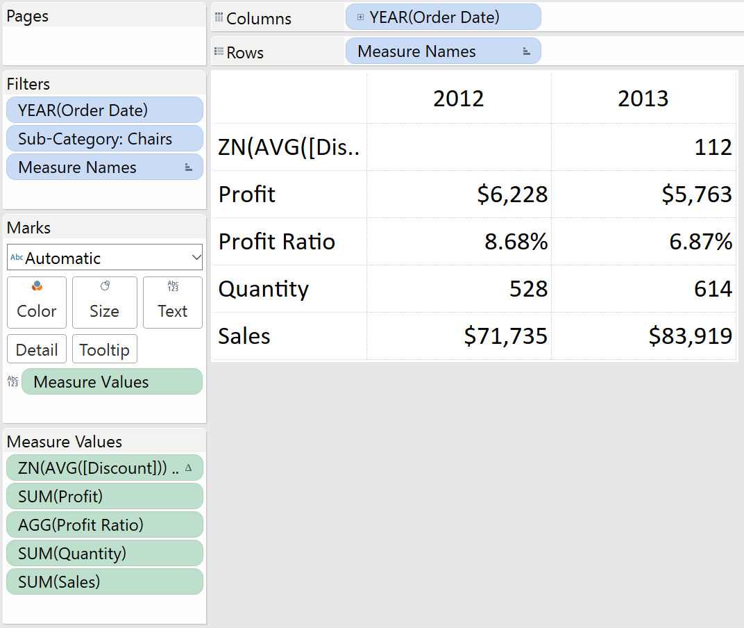
Here is how our table of year over year KPIs is set up in Tableau:
The formula for a 100-point year over year index is: (This Year’s Performance / Last Year’s Performance) * 100
Note you could use a different comparison point than last year’s performance by just substituting “Last Year’s Performance” with something else, such as a goal.
To create this calculated field in Tableau, you could manually create a calculated field and type out the logic, but we am going to lean on table calculations for a head start.
First, right-click on a measure on the measure values shelf and choose “Quick Table Calculation”. The Difference table calculation is the closest to our index formula so we are going to choose that:

After adding the table calculation for difference, the formula looks like this:
ZN(AVG([Discount])) – LOOKUP(ZN(AVG([Discount])), -1)
In English, this is just saying if there is a value for Discount in the right column, take that value and subtract the value from one column prior.
There are just two small changes that need to be made to this calculation to convert it into a 100-point index score. These changes can be made by simply double-clicking on the measure that you just added the table calculation to on the measure values shelf.
First, change the minus sign to a division sign (“/”). Then add “*100” to the end. The formula for a 100-point index score looking at the Discount measure is:
ZN(AVG([Discount])) / LOOKUP(ZN(AVG([Discount])), -1)*100
If your measure had any predefined number formatting, you will want to change the formatting to number custom with no decimal places.
This can be accomplished by right-clicking on the measure, choosing format, then changing the number format.
For example, our discount measure is normally displayed as a percentage, so we need to change the number format for my index score so that it is not displayed as a percentage or multiplied by 100 again.
At this point, our view looks like this:

If you want to give the calculation a better name and have it available for future use, drag the newly created measure from the measure values shelf to the measures shelf where the rest of your measures reside.
You will then be able to give it a name and Tableau will save the calculation as a calculated field in your workbook.
Repeat this process for the rest of your measures on the view and you have a nice table of 100-point index scores.
Adding Color to a 100-Point Index Table
The view we have created at this point is providing a lot of value because the user can very quickly determine at what scale the KPIs are underperforming or outperforming the comparison point.
However, the view can be processed even faster by converting the crosstab of index scores into a highlight table.
For more on highlight tables, see How to Make a Highlight Table in Tableau.
We mentioned earlier that measure values cannot currently be used in calculated fields, which prevents us from creating one calculated field to provide logic on how Tableau should color each index score. Fortunately, measure values can be used on the color marks card.
Now that all of our scores are normalized on a 100-point scale, they can share the same color scale.
If you drag the measure values field onto the color marks card, the higher index scores will be colored darker green, and the lower index scores will be colored lighter green.
Now here’s the cool part.
You can use a custom ordered-sequential color palette, combined with specific step-sizes and ranges, to get the index scores colored as you would like
Creating custom color palettes is beyond the scope of this post, but if you would like to learn more, there is a great Tableau Knowledge Base article called Create a Custom Color Palette Tableau.
In the meantime, follow these steps and you can use the custom color palette below:
- On your computer, navigate to Documents > My Tableau Repository
- Right-click on the file called Preferences and open it with Notepad
- Paste this code over everything in the file (assuming you don’t have other custom colors), then save the file:
<?xml version=’1.0′?>
<workbook>
<preferences>
<color-palette name=”Stoplight 100-Point Index (1 Scale)” type=”ordered-sequential” >
<color>#db5656</color>
<color>#db5656</color>
<color>#db5656</color>
<color>#db5656</color>
<color>#db5656</color>
<color>#db5656</color>
<color>#db5656</color>
<color>#db5656</color>
<color>#db5656</color>
<color>#edc64c</color>
<color>#42af9b</color>
<color>#42af9b</color>
<color>#42af9b</color>
<color>#42af9b</color>
<color>#42af9b</color>
<color>#42af9b</color>
<color>#42af9b</color>
<color>#42af9b</color>
<color>#42af9b</color>
<color>#42af9b</color>
</color-palette>
</preferences>
</workbook>
In order for new custom colors to be available, you have to close and reopen Tableau.
Now that you have this color palette available, you can choose this palette and apply some additional settings so that every score above 100 is colored green, every score between 90 and 99 is colored yellow, and every color below 90 is colored red.
To change the color palette and edit the settings, click on the color legend for measure values.
The first nine colors are red, which covers scores 0 – 90; the tenth slot is yellow, which covers scores between 90 – 100; the rest of the slots are green and cover scores 100 and up.
With this in mind, the color settings are the result of some basic mathematical problem solving.
We’ll make the scale go from 0 – 200 and set the step size to 20 so that we know that each color on our sequential palette will represent 10 points or 5% of the spectrum.
Here’s how our view looks with our color settings:
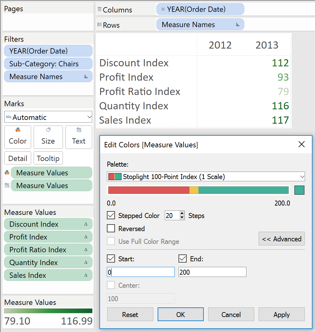
Our color palette has 20 colors in it that go in sequential order.
After saving the color settings, convert the view to a highlight table by changing the mark type from automatic to square.
Our final index score view looks like this:
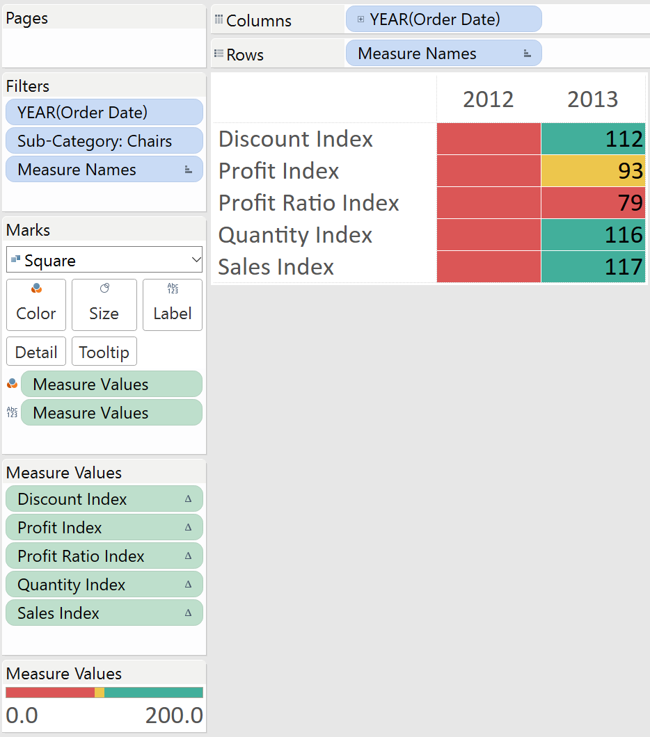
From here, we could hide the 2012 column or even float this view next to the original table of numbers on a dashboard as pictured at the beginning of this post.
What if Outperforming the Comparison is Bad?
Sometimes an index score greater than 100 is bad.
For example, we probably don’t want to increase the discounts we are handing out to customers each year, but the index table we just made shows discount as green because it increased 12 points year over year.
To alleviate this, we have come up with a little trick for creating stoplight 100-point index tables, even when an index greater than 100 can mean something positive or negative.
First, we have extended our custom sequential color palette to include 40 steps.
The first 20 steps cover scores that would be bad if the index is greater than 100; the next 20 steps cover our existing index scores, when a score above 100 is positive.
Here is the palette if you want to add it to your custom colors as outlined before:
<color-palette name=”Stoplight 100-Point Index (2 Scales)” type=”ordered-sequential” >
<color>#db5656</color>
<color>#db5656</color>
<color>#db5656</color>
<color>#db5656</color>
<color>#db5656</color>
<color>#db5656</color>
<color>#db5656</color>
<color>#db5656</color>
<color>#db5656</color>
<color>#edc64c</color>
<color>#42af9b</color>
<color>#42af9b</color>
<color>#42af9b</color>
<color>#42af9b</color>
<color>#42af9b</color>
<color>#42af9b</color>
<color>#42af9b</color>
<color>#42af9b</color>
<color>#42af9b</color>
<color>#42af9b</color>
<color>#db5656</color>
<color>#db5656</color>
<color>#db5656</color>
<color>#db5656</color>
<color>#db5656</color>
<color>#db5656</color>
<color>#db5656</color>
<color>#db5656</color>
<color>#db5656</color>
<color>#edc64c</color>
<color>#42af9b</color>
<color>#42af9b</color>
<color>#42af9b</color>
<color>#42af9b</color>
<color>#42af9b</color>
<color>#42af9b</color>
<color>#42af9b</color>
<color>#42af9b</color>
<color>#42af9b</color>
<color>#42af9b</color>
</color-palette>
Once you have saved the new colors and closed / reopened Tableau, there are just two steps to get the desired effect:
- Using the new custom color palette, change the steps to 40 and the range from -200 to 200
- For any measure that you don’t want to outperform the comparison, multiply it by negative one
In the Sample Superstore example that we are working with, we will multiply Discount by negative one by double-clicking the Discount Index field on the measures shelf and adding “-“ to the beginning.
Adding a negative sign to the beginning is the same thing as multiplying the calculation by -1.
Our view now looks like this:
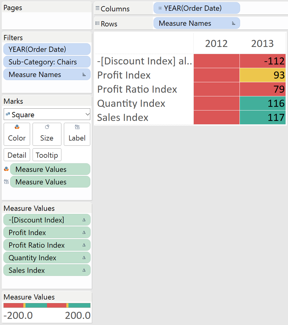
Now the index score for discount will be green only if it’s less than 100.
If it’s within 10% higher, it will be colored yellow, and if it’s more than 10% higher it will be colored red.
You’ll see that a negative sign was added to the score. You can edit the format of negative numbers, but cannot get rid of the extra distinction.
We like to have a visual indicator that some metrics are on a different scale than the others.
Here is how our final view looks with the KPI table and index highlight table on two scales:
Finally, we would be remiss if we didn’t mention that there is some science that tells us the stoplight color palette is not the best choice for the colorblind.
Not to mention that (in our humble opinion) red and green is one of the ugliest color pairings.
We provided the stoplight example because those are the most common colors requested, and the stoplight concept, as well as the meaning of the stoplight’s traditional colors, are ingrained in the human psyche.
That being said, we encourage you to substitute the hex color values for green, yellow, and red with your own alternatives.
Try blue for good, white for okay, and orange for bad. Or maybe there’s a way to put the stoplight index into your own brand’s colors. We assure you it will be okay if you try something different.
Written By

Evolytics
This post is curated content from the Evolytics staff, bringing you the most interesting news in data and analysis from around the web. The Evolytics staff has proven experience and expertise in analytics strategy, tagging implementation, data engineering, and data visualization.