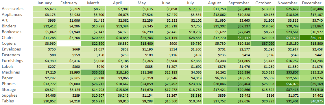
In our data-driven storytelling tips series, we demonstrate an exercise for “Smoothing the Excel Transition” by introducing the value of data visualization.
In the example, we simply encode the values in a large text table of data by color – the higher the sales values, the darker the green.
The result is called a highlight table.
Highlight tables are one of the simplest chart types to create, but are also among the most powerful. When compared to a crosstab (a.k.a. text table) view, this basic data visualization helps reduce the time to insight and improve the accuracy of insights.
Highlight tables are definitely worth making a part of your chart type tool belt, right alongside bar charts and line graphs.
They are best for:
- Quickly identifying highs and lows or other points of interest in your data.
- A means of enhancing a crosstab.
- A tactic for helping smooth the Excel transition.
Highlight tables consist of one or more dimensions and exactly one measure (the color).
Here’s how they’re made:
How to Make a Highlight Table in Tableau
Before we begin, let’s see how the final product will look:
You can create a highlight table with any combination of one or more dimensions and one measure, but if you would like to follow along, the following example will use the Sample – Superstore data that comes with Tableau.
You can also create a highlight table using Show Me, but we prefer to learn by creating chart types manually so we understand how Tableau is generating the data visualization.
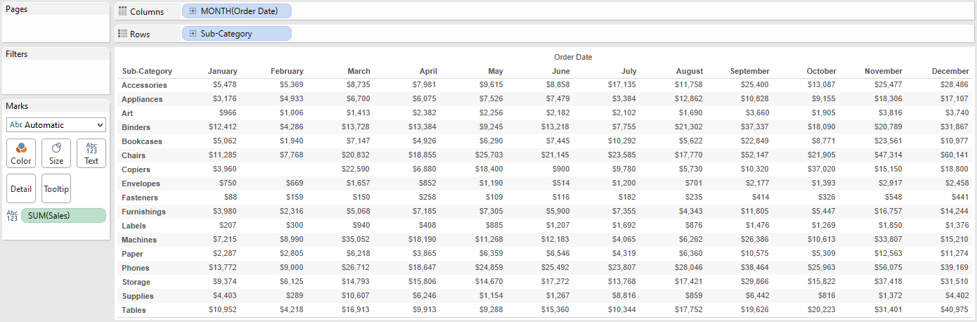
Step 1 – Make a Crosstab of Data
First, make a basic text table. In our example, we are looking at the measure of Sales by the dimensions of Sub-Category and Month of Order Date (Discrete).
At this point, our view looks like this:
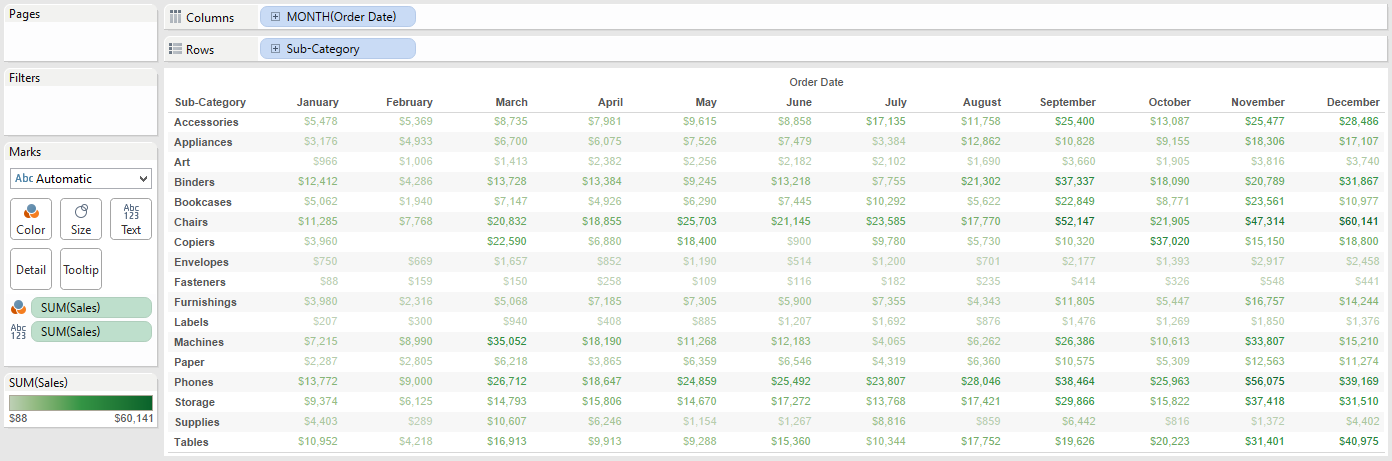
Step 2 – Color the Numbers by Sales
Second, color the displayed sales values in the text table by dragging the sales measure from the list of measures to the Color Marks Card.
Note that the Sales measure is now on the marks shelf twice: once for text and once for color.
At this point, our view looks like this:
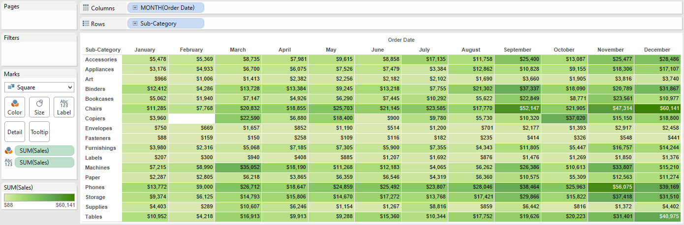
Step 3 – Create a Highlight Table by Changing the Mark Type
While more helpful than a raw table of numbers, the view we have created so far can still be improved. The numbers themselves are encoded by color, which helps us recognize highs and lows in the data more quickly than we could with a crosstab, but there is a lot of white space around each number.
The final step in converting this view to a highlight table is to simply change the mark type from Automatic (which at this point is Text) to Square.
When you convert the mark type from Text to Square in a crosstab view, the “Square” mark type fills each cell, creating a highlight table.
In building text tables, we also like to add a white border around each cell; this can be accomplished by clicking on the Color Marks Card and changing the border.
Our final highlight table looks like this:
Written By

Evolytics
This post is curated content from the Evolytics staff, bringing you the most interesting news in data and analysis from around the web. The Evolytics staff has proven experience and expertise in analytics strategy, tagging implementation, data engineering, and data visualization.